
Human-computer interaction (HCI) and user experience (UX) study how people understand, operate, trust, and feel about digital systems. A program may be technically powerful, but if users cannot find what they need, recover from mistakes, read the screen comfortably, or complete tasks with confidence, the product has not truly succeeded. HCI and UX therefore connect technical design with human attention, memory, emotion, accessibility, and real-world context.
For students preparing for university, this topic is especially valuable because it shows that software development is not only about writing code. It is also about designing systems that people can actually use. A good interface depends on clear software architecture and design, careful software engineering, reliable software testing and quality assurance, and thoughtful improvement over time through software maintenance and evolution.
HCI and UX also connect strongly with modern web and mobile work. A student interested in web development and design, front-end web development, web design, web performance optimization, web analytics, or mobile application development will repeatedly meet UX questions: What should users see first? How much information is too much? Why do users abandon a form? How can errors be prevented? How can accessibility be built in from the start?

This illustration presents HCI and UX as a busy design lab where people, interfaces, and feedback loops meet. The large screen suggests wireframes, navigation paths, and interface components. The people testing screens on laptops and tablets represent user research, usability testing, and iterative refinement. The symbols around the interface suggest evaluation metrics, accessibility checks, and design decisions that shape whether technology feels helpful, trustworthy, and easy to use.
User-Centered Foundations in Software Creation
Explore how human-computer interaction and user experience design intersect with core engineering modules across the Software Development cluster. Interface mechanics and usability standards rely directly on robust architectural and implementation layers.
Software Development Overview
Establishes the foundational end-to-end software lifecycle framework. It explains how user requirements, usability criteria, and interface prototypes integrate directly into production engineering workflows.
Human-Computer Interaction and UX
Focuses on cognitive load, perceptual ergonomics, mental models, and interactive accessibility. It provides qualitative and quantitative frameworks to evaluate system learnability and user satisfaction.
Software Architecture and Design
Details presentation layer separation patterns (MVC, MVVM, UDF) that isolate interactive frontend layouts from core backend business logic and database persistence engines.
Software Testing and Quality Assurance
Covers empirical usability evaluations, automated accessibility audits (WCAG A/AA/AAA checks), and user acceptance testing (UAT) to catch interaction defects before release.
Mobile Application Development
Applies touch-target ergonomics (≥44pt targets), gesture dynamics, and responsive viewport scaling across smartphones, tablets, and wearable form factors.
Programming Languages and Paradigms
Examines how reactive programming models, event dispatchers, and state management frameworks power real-time UI updates and responsive event loops.
Software Engineering
Connects agile user stories, wireframe prototyping, and human-centered design sprints with version control workflows and CI/CD release pipelines.
Software Maintenance and Evolution
Explains how telemetry analytics, heatmaps, and user feedback loops inform post-launch UI refactoring, accessibility patches, and feature evolution over time.
Embedded Systems and IoT Development
Extends interaction design into physical micro-displays, ambient indicator lights, haptic controls, and hardware status panels on edge devices.
What HCI and UX Really Mean
HCI is the study of how humans interact with computers and digital systems. It asks questions such as: How do people notice information? How do they make decisions? What causes mistakes? What kinds of feedback help people feel in control? UX is closely related, but it looks more broadly at the user’s whole experience before, during, and after using a product. It includes usability, usefulness, trust, accessibility, satisfaction, emotion, and the overall journey.
A simple way to remember the difference is this: HCI helps explain the human-system relationship, while UX applies that understanding to create better products and services. UI design then shapes the visible and interactive surface: buttons, menus, forms, screens, colours, typography, icons, and feedback messages. These three areas overlap, but they are not identical.
HCI asks how interaction works
It studies attention, memory, perception, feedback, errors, mental models, accessibility, and human behaviour.
UX asks how the whole journey feels
It considers whether users can achieve their goals smoothly, confidently, and with minimal frustration.
UI design shapes what users see and touch
It turns interaction decisions into screens, controls, layouts, icons, forms, and visual hierarchy.
Usability checks whether the design works
It examines whether users can learn, remember, complete, and recover from tasks effectively.
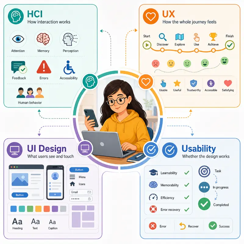
This illustration explains the relationship between Human-Computer Interaction, User Experience, UI design, and usability. At the centre, a user works with a laptop and smartphone, representing the real person whose needs guide design decisions. Around the user, four panels show the main areas of focus. HCI explores how interaction works through attention, memory, perception, feedback, errors, accessibility, and human behaviour. UX considers the whole user journey, from discovering a product to completing a goal, including usefulness, trust, accessibility, satisfaction, and emotion. UI design shapes what users see and touch, such as screens, buttons, menus, icons, forms, colours, typography, and layout. Usability checks whether the design actually works by examining learnability, memorability, efficiency, error recovery, and task completion. Together, the panels show that good digital design is not only about attractive screens, but about helping people achieve their goals smoothly and confidently.
Key Topics in HCI and UX
HCI and UX are broad fields, but several recurring ideas appear again and again in university courses and professional design work. Students do not need to master everything at once. The important first step is to recognise how each idea helps designers move from guessing to evidence-based improvement.
User Research
User research studies people’s goals, habits, frustrations, contexts, and constraints through interviews, observation, surveys, diary studies, and analytics.
Personas and User Journeys
Personas and journey maps help teams imagine realistic users, their tasks, their pain points, and the steps they take across a product or service.
Information Architecture
Information architecture organises content, menus, labels, categories, and navigation paths so that users can find what they need without confusion.
Interaction Design
Interaction design focuses on how users act, how the system responds, and how feedback, motion, prompts, and controls guide the next step.
Wireframing and Prototyping
Wireframes and prototypes allow designers to test early ideas before expensive development work begins.
Usability Testing
Usability testing observes real or representative users attempting realistic tasks, revealing problems that designers may not notice by themselves.
Accessibility and Inclusive Design
Accessibility ensures that digital systems can be used by people with different abilities, devices, environments, and input methods.
UX Metrics and Analytics
UX metrics such as task success, time on task, error rate, conversion rate, bounce rate, and satisfaction scores help teams measure improvement.
Core Usability Principles
Usability is not decoration. It is the quality that allows people to use a system effectively and with reasonable comfort. A visually attractive interface can still fail if users cannot predict what will happen, recover from mistakes, or locate important information. Established usability ideas such as learnability, efficiency, memorability, error tolerance, and satisfaction help designers evaluate whether an interface supports human behaviour.
Learnability
A new user should be able to understand the basic actions without needing long instructions.
Efficiency
Once users know the interface, they should be able to complete common tasks quickly and accurately.
Memorability
A returning user should be able to regain confidence without relearning the entire system.
Error Prevention
Good design reduces the chance of mistakes through clear labels, constraints, previews, confirmations, and sensible defaults.
Error Recovery
When mistakes happen, the system should help users understand the problem and recover without panic.
Satisfaction
A usable system should feel clear, respectful, and supportive rather than tiring or unnecessarily complicated.
One widely used professional reference is Nielsen Norman Group’s 10 usability heuristics, which include principles such as visibility of system status, consistency, error prevention, recognition rather than recall, and helping users recover from errors. These heuristics are useful because they give designers a practical checklist for reviewing interfaces before and after user testing.
The HCI and UX Design Process
A strong UX process is not a straight line from idea to final screen. It is usually a cycle. Designers investigate the problem, sketch possible solutions, test them with users, learn from evidence, and improve the design. This cycle continues because user needs, devices, accessibility expectations, and business conditions change over time.
1. Understand the Problem
Clarify who the users are, what they are trying to achieve, where they face difficulty, and why the product matters.
2. Research the Users
Gather evidence from interviews, observation, surveys, support tickets, analytics, and existing product behaviour.
3. Define the Journey
Map the steps users take, the decisions they make, the points where they hesitate, and the information they need.
4. Sketch and Prototype
Create low-fidelity and high-fidelity prototypes so that ideas can be explored before full implementation.
5. Test with Users
Ask users to attempt realistic tasks while observing where they succeed, struggle, guess, pause, or make errors.
6. Improve and Repeat
Use the evidence to refine navigation, wording, layout, accessibility, feedback, and task flow.
This process is consistent with human-centred design thinking, where products are shaped around users, tasks, environments, and measurable outcomes. It also connects naturally with software engineering, because user requirements, prototypes, tests, and iteration all influence what the development team eventually builds.
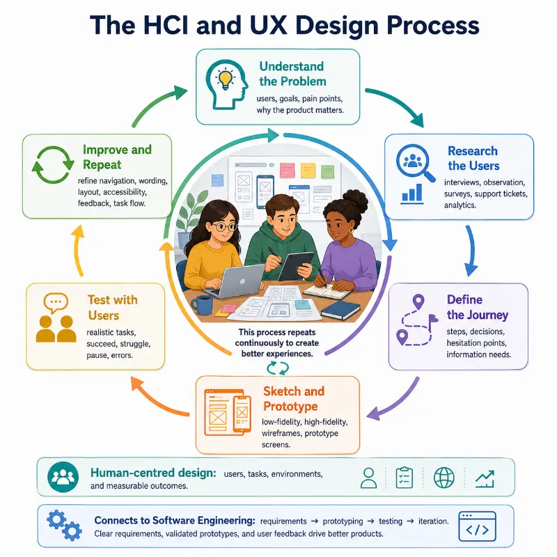
This illustration presents the HCI and UX design process as a continuous cycle rather than a one-way path. At the centre, a small team works together around sketches, wireframes, and digital devices, representing collaboration in user-centred design. Around them, six connected stages show the main flow of the process. The first stage is understanding the problem by identifying users, goals, pain points, and the importance of the product. The second stage is researching the users through interviews, observation, surveys, support tickets, and analytics. The third stage defines the journey by mapping steps, decisions, hesitation points, and information needs. The fourth stage focuses on sketching and prototyping, from low-fidelity wireframes to high-fidelity screens. The fifth stage tests the design with users by observing success, confusion, pauses, and errors during realistic tasks. The sixth stage improves and repeats by refining navigation, wording, layout, accessibility, feedback, and task flow. The lower part of the illustration also highlights that this cycle reflects human-centred design and connects naturally to software engineering through requirements, prototyping, testing, and iteration.
Accessibility and Inclusive Design
Accessibility is not a small final adjustment. It should be part of design from the beginning. A website or app should work for people who use screen readers, keyboard navigation, captions, voice input, high contrast settings, zoomed text, assistive technologies, slow connections, small screens, or older devices. Good accessibility often improves usability for everyone, not only for users with disabilities.
Perceivable
Users must be able to perceive the information, whether through text, audio, captions, alternative text, or clear visual structure.
Operable
Users must be able to operate the interface using appropriate input methods, including keyboard navigation and assistive technologies.
Understandable
Content, instructions, labels, errors, and navigation should be clear enough for users to know what to do next.
Robust
The interface should work reliably across browsers, devices, and assistive technologies as standards evolve.
The Web Content Accessibility Guidelines organise accessibility around these four broad principles: perceivable, operable, understandable, and robust. For students, WCAG is useful because it turns a moral idea into practical design questions: Can the image be understood without sight? Can the form be completed without a mouse? Can the error message actually help? Can the page still work when text is enlarged?
Applications of HCI and UX
HCI and UX matter wherever humans use technology. The field is not limited to attractive app screens. It shapes safety, learning, productivity, trust, inclusion, and business performance across many types of systems.
Software Applications
Clear menus, helpful feedback, predictable workflows, and error recovery make everyday software more efficient and less frustrating.
Mobile Apps
Mobile UX must consider touch targets, screen size, gestures, battery life, interruptions, notifications, and one-handed use.
E-Commerce Platforms
Checkout design, product filters, search, trust signals, payment flow, and form clarity can strongly affect conversion rates.
Educational Technology
Learning platforms need clear progression, feedback, motivation, accessibility, and low cognitive load so students can focus on learning.
Healthcare Systems
Medical interfaces must support accuracy, privacy, safety, readable information, and efficient workflows under stressful conditions.
Smart Devices and IoT
IoT products depend on simple setup, meaningful status indicators, reliable connectivity, and controls that match physical context.
Cybersecurity Interfaces
Security warnings, password systems, privacy settings, and permission requests must be understandable enough for users to act safely.
Data Dashboards
Dashboards must show complex information in a way that supports quick interpretation, comparison, and decision-making.
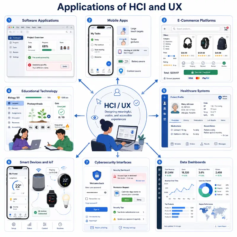
This illustration presents the applications of HCI and UX across a wide range of digital systems. At the centre, a designer works at a laptop, representing the goal of creating meaningful, usable, and accessible experiences. Around the centre, eight panels show how HCI and UX are applied in different contexts. Software applications highlight clear menus, predictable workflows, useful feedback, and error recovery. Mobile apps show the importance of touch targets, gestures, notifications, battery awareness, and one-handed use. E-commerce platforms focus on filters, search, trust signals, smooth checkout, and payment clarity. Educational technology shows learning interfaces that support progression, motivation, accessibility, and low cognitive load. Healthcare systems emphasise accuracy, privacy, readability, safety, and efficient workflows. Smart devices and IoT illustrate the need for simple setup, clear status indicators, reliable connectivity, and controls suited to physical environments. Cybersecurity interfaces highlight understandable warnings, login systems, permission requests, and privacy settings that help users act safely. Data dashboards show how complex information must be organised for quick interpretation, comparison, and decision-making. Together, the panels show that HCI and UX are not limited to attractive screens, but play an important role in safety, learning, productivity, trust, inclusion, and business performance.
Modern Trends in HCI and UX
User expectations continue to change as technology becomes more personal, mobile, intelligent, and embedded in everyday environments. These trends do not replace basic usability principles. Instead, they make those principles even more important, because complex systems still need to feel understandable and trustworthy.
AI-Assisted Interfaces
AI can personalise recommendations, summarise information, automate tasks, and support natural language interaction, but it must remain transparent and controllable.
Voice and Conversational UX
Voice assistants and chat interfaces require careful wording, turn-taking, error handling, and awareness of user intent.
AR and VR Interaction
Immersive systems require designers to think about space, motion, comfort, attention, and interaction beyond flat screens.
Wearable Technology
Wearables require short, timely, low-distraction interactions because the screen is small and the user may be moving.
Ethical Personalisation
Personalisation can help users, but it also raises questions about privacy, consent, manipulation, and fairness.
Design for Trust
Users need to understand what a system is doing, what data it uses, and how they can control important decisions.
Why Study HCI and UX?
Students sometimes think of computing as a purely technical field. HCI and UX show a wider picture: technology succeeds only when it fits human life. This makes the field attractive to students who enjoy both logical thinking and human-centred problem solving.
It connects technology with real people
HCI and UX help students understand that users are not abstract. They have goals, habits, emotions, limitations, and contexts.
It builds better software judgement
Students learn to ask whether a feature is useful, discoverable, accessible, and efficient, not merely whether it can be coded.
It develops research and communication skills
UX work involves interviews, observation, explanation, sketching, testing, reporting, and collaboration across teams.
It supports inclusive design
Students learn to design for people with different abilities, devices, cultures, languages, and levels of technical confidence.
It prepares students for modern careers
Career paths include UX designer, UX researcher, interaction designer, product designer, usability analyst, information architect, and front-end designer.
It improves many other IT specialisations
HCI thinking is useful in web development, mobile apps, cybersecurity, data dashboards, AI systems, educational technology, and smart devices.
Numerical Problems and Solutions in HCI and UX
Numerical reasoning helps UX teams judge whether a redesign has genuinely improved the user experience. The following problems use simple percentages, probabilities, averages, and expected values to evaluate system changes, featuring production data benchmarks modeled directly from our live Boson Search Engine.
1) Task success rate analytics
A usability test involves 50 participants evaluating the Boson Search interface. Of these, 30 complete the task successfully using the default configuration. If a button layout optimization aims to improve the success rate by 20% relative to the original success rate, what is the expected number of successful completions?
Solution:
- Original success rate:$$ \frac{30}{50} = 0.60 = 60\% $$
- A 20% relative improvement means:$$ 0.60 \times 0.20 = 0.12 $$ $$ 0.60 + 0.12 = 0.72 = 72\% $$
- Expected successful completions:$$ 50 \times 0.72 = 36 $$
Answer: The expected number of successful completions is 36 users.
UX meaning: The layout adjustments improve the original success rate by 20% of its own value. It does not add 20 percentage points directly.
2) Task completion time reduction
By switching the Boson search button layout natively to the left side and stretching the input box to 100% container width, the average query submission time drops from 120 seconds to 90 seconds. What is the percentage reduction in time, and how many seconds are saved per task?
Solution:
- Time saved:$$ 120 – 90 = 30 \text{ seconds} $$
- Percentage reduction:$$ \frac{30}{120} \times 100 = 25\% $$
Answer: The redesign saves 30 seconds per task, which is a 25% reduction in task completion time.
UX meaning: Re-anchoring elements to match natural ocular tracking paths ensures user journeys become faster and less demanding.
3) Error probability compounding in multi-step forms
A digital input field has a 15% error rate before auto-complete filters are added. For a multi-step dashboard containing 10 independent input rows, calculate the probability that a user makes no errors and the expected number of errors per user.
Solution:
- Probability of no error in one field:$$ 1 – 0.15 = 0.85 $$
- Probability of no errors across 10 independent fields:$$ 0.85^{10} \approx 0.1969 $$ $$ 0.1969 \times 100 \approx 19.69\% $$
- Expected number of errors:$$ 10 \times 0.15 = 1.5 $$
Answer: The probability of no errors is approximately 19.69%, and the expected number of errors is 1.5 errors per user.
UX meaning: Even a moderate error rate per field compounded across large forms drastically increases interaction friction.
4) Latency compression and user satisfaction score
A web search utility initially takes 3 seconds to complete a query loop. After converting the core logic to an memory-efficient O(1) associative array hashing array, the response loop decreases by 40%. What is the new performance speed, and what is the expected improvement in user satisfaction if each 1-second decrease increases satisfaction by 5%?
Solution:
- Load time reduction:$$ 3 \times 0.40 = 1.2 \text{ seconds} $$
- New load time:$$ 3 – 1.2 = 1.8 \text{ seconds} $$
- Expected satisfaction improvement:$$ 1.2 \times 5\% = 6\% $$
Answer: The new search execution latency is 1.8 seconds, and the expected satisfaction improvement is 6%.
UX meaning: Algorithmic architecture choices directly impact loading thresholds, which helps systems feel more responsive and reliable.
5) Conversion rate delta across search overhaul
An e-commerce site has a baseline checkout conversion rate of 2%. After a structural search box overhaul that lets users locate items instantly, the conversion rate improves to 3%. For 10,000 visitors, what is the percentage increase in conversions and the difference in the absolute number of conversions?
Solution:
- Original conversions:$$ 10{,}000 \times 0.02 = 200 $$
- New conversions:$$ 10{,}000 \times 0.03 = 300 $$
- Increase in conversions:$$ 300 – 200 = 100 $$
- Percentage increase:$$ \frac{100}{200} \times 100 = 50\% $$
Answer: The site gains 100 additional conversions, representing a 50% increase in absolute checkouts.
UX meaning: Minor modifications to structural interface nodes yield massive conversion performance updates at commercial scales.
6) A/B split validation analytics
During an A/B split validation run, Boson Search Version A (standard matching) yields a 70% success rate, while Version B (using the new suffix stemming engine) has an 80% success rate. If 200 users test each version, calculate the difference in successful outcomes and the percentage improvement relative to Version A.
Solution:
- Version A successes:$$ 200 \times 0.70 = 140 $$
- Version B successes:$$ 200 \times 0.80 = 160 $$
- Difference in successful outcomes:$$ 160 – 140 = 20 $$
- Percentage improvement relative to Version A:$$ \frac{20}{140} \times 100 \approx 14.29\% $$
Answer: Version B produces 20 more successful outcomes, which is an improvement of approximately 14.29% relative to Version A.
UX meaning: Integrating robust semantic processing lets search interfaces tolerate variant word forms, decreasing failure rates.
7) Intent pseudonym mapping error reduction
Before integrating an intent pseudonym map, users make an average of 2 errors per session trying to guess exact title words. After mapping terms like “maths” directly to “mathematical,” errors reduce by 25%. What is the new average number of errors, and how many errors are prevented over 100 sessions?
Solution:
- Error reduction per session:$$ 2 \times 0.25 = 0.5 $$
- New average number of errors:$$ 2 – 0.5 = 1.5 $$
- Errors prevented over 100 sessions:$$ 0.5 \times 100 = 50 $$
Answer: The new average is 1.5 errors per session, and 50 errors are prevented over 100 sessions.
UX meaning: Adding smart dictionary routing mitigates cognitive load and minimizes task abandonment drops.
8) Post-activation survey satisfaction rating
Following the activation of the Boson interactive “Load More” pagination feature, user experience survey logs display a jump in satisfaction from 3.5 to 4.2 out of 5. What is the absolute improvement and the percentage increase?
Solution:
- Absolute improvement:$$ 4.2 – 3.5 = 0.7 $$
- Percentage increase relative to the original score:$$ \frac{0.7}{3.5} \times 100 = 20\% $$
Answer: The absolute improvement is 0.7 points, and the percentage increase is 20%.
UX meaning: Giving users manual control over item limits prevents cognitive overwhelm, creating a better reading flow.
9) Navigation tree depth click compression
Locating a specialized resource deep inside a structural category tree initially takes 8 clicks. By dropping the shortcode component hook into the global header widget, access drops to 5 clicks. What is the percentage decrease in clicks, and how much time is saved if each click takes 0.5 seconds?
Solution:
- Click reduction:$$ 8 – 5 = 3 $$
- Percentage decrease in clicks:$$ \frac{3}{8} \times 100 = 37.5\% $$
- Time saved:$$ 3 \times 0.5 = 1.5 \text{ seconds} $$
Answer: The number of clicks decreases by 37.5%, and the user saves 1.5 seconds per task.
UX meaning: Minimizing structural steps allows users to locate critical resources with less friction.
10) Resilience safety net bounce rate analytics
When zero-match queries trigger a site-wide sitemap mapping array rather than displaying an empty error page, the bounce rate drops from 50% to 35%. What is the relative percentage decrease?
Solution:
- Absolute drop in bounce rate:$$ 50\% – 35\% = 15\% $$
- Relative percentage decrease:$$ \frac{15}{50} \times 100 = 30\% $$
Answer: The bounce rate has a 30% relative decrease.
UX meaning: A resilient safety net structure keeps users engaged even when their primary query does not yield an exact match.
Engineering FAQs: Human Factors & Usability Systems
How do Nielsen’s 10 Usability Heuristics reduce cognitive load during interface navigation?
Nielsen’s heuristics prioritize recognition over recall and enforce visibility of system status. By presenting clear visual affordances and maintaining consistent design patterns, interfaces minimize working memory utilization, allowing users to make decisions intuitively without reading long documentation.
What is the difference between WCAG 2.1 Level A, AA, and AAA accessibility compliance?
Level A establishes essential baseline accessibility (e.g., non-text alt content, keyboard access without traps). Level AA addresses common accessibility barriers across broad audiences (e.g., minimum 4.5:1 text color contrast ratios, resizable text up to 200%). Level AAA enforces stringent requirements (e.g., 7:1 contrast ratios, sign language translation) often required for specialized public or government software systems.
Why are quantitative UX metrics combined with qualitative user research during product evaluations?
Quantitative analytics (clickstreams, bounce rates, task completion times) specify what is happening in an application, while qualitative research (usability testing observation, contextual interviews) reveals why users experience confusion or frustration. Combining both ensures design decisions address root perceptual causes rather than surface symptoms.
How does Fitts’s Law govern touch-target sizing in modern mobile UI frameworks?
Fitts’s Law states that the time required to move to a target area is a function of the distance to the target and the target’s size. In touch interfaces, controls must maintain minimum dimensions (≥44×44 pt / 48×48 dp) and sit within comfortable thumb reach zones to minimize target acquisition time and accidental tap errors.
What strategies prevent error loops in complex multi-step web forms?
Preventing error loops involves combining inline field validation with proactive constraints (e.g., disabled out-of-range dates, real-time input formatting). When validation fails, the interface must provide clear, human-readable error messages pointing directly to the offending field alongside actionable recovery instructions.
Core Documentation & External References
Human-Computer Interaction & UX — Learning & Wrap-Up
Summary
- Perceptual Design: Structure digital layouts around human attention span, memory limits, and clear system status feedback.
- Iterative Research: Validate prototypes through usability testing, persona mapping, and quantitative A/B testing frameworks.
- Inclusive Accessibility: Enforce WCAG guidelines to guarantee software usability across diverse abilities, devices, and adaptive contexts.
- Engineering Alignment: Connect user-centered requirements with clean software architecture to build performant, maintainable interfaces.
Review Questions & Answers
1) What distinguishes HCI theory from practical UX/UI design execution?
Answer: HCI provides cognitive and perceptual models explaining how humans process information and interact with technology. UX/UI design applies these theoretical models to build intuitive workflows, visual layouts, and interactive components in production applications.
2) How do responsive design patterns support accessibility across varying device displays?
Answer: Responsive design uses flexible grids, fluid typography, and dynamic layout breakpoints to adapt content across screen sizes without horizontal scrolling or text truncation, ensuring readability across desktop and mobile assistive displays.
3) What role do micro-interactions play in user feedback loops?
Answer: Micro-interactions (e.g., button press state changes, loading spinners, subtle haptic alerts) confirm to the user that the system has registered their input action, preventing duplicate submissions and interaction uncertainty.