

This vibrant visual collage showcases the multifaceted world of graphic design. At the center, concentric color wheels and a stylized pen symbolize precision and creativity. Surrounding the core are tools such as pencils, screens, typography grids, and swatches that represent both digital and manual aspects of the design process. Each element is rendered in bold hues and dynamic arrangements, reflecting the discipline’s focus on visual harmony, brand identity, and effective communication. The image captures the essence of modern graphic design as a fusion of art, technology, and purposeful aesthetics.
Where Graphic Design Leads When You Follow It Further
Interactive Studio: Grid & Typographic Hierarchy Simulator
Experiment with visual hierarchy, column grids, and spacing in real-time. See how aligning elements transforms an unstructured layout into a professional composition.
Graphic Design Studio: Core Skills and Projects
A practical track for typography, layout, imagery, and systems. Includes weekly drills, briefs, hand-in specs, and grading rubrics. Tools may be analog or digital; standards emphasise readability, hierarchy, and consistency.
A. Core Skill Modules
1) Typography Fundamentals
Learn: Anatomy, classification, metrics (leading, tracking, kerning), measure, rag, hyphenation, optical alignment.
Minimum competency: Typeset a two-column article (800–1200 words) with proper hierarchy (H1/H2/pull-quote/captions), baseline grid, and a readable rag.
Drills: Kerning pairs; widows/orphans elimination; pull-quote contrast tests.
Deliverable: A3 print/PDF: article spread (grid visible version + final).
2) Grid Systems & Layout
Learn: Single/dual column, modular grids, gutters, rhythm, baseline alignment across columns, alignment vs. proximity.
Minimum competency: Create a 12-column modular grid poster and a 6-column magazine spread with consistent rhythm.
Deliverable: Two A3 boards with grid overlays + final designs.
3) Image Making & Contrast
Learn: Vector vs. raster, resolution, masks, duotone, iconography, hierarchy through scale/weight/space.
Minimum competency: Build an icon set (12 icons) consistent in stroke, corner radius, optical balance.
Deliverable: SVG set + A3 presentation sheet.
4) Color for Communication
Learn: Accessibility contrast (WCAG AA), brand palettes, semantic color, print vs. screen profiles (CMYK/RGB), spot colors.
Minimum competency: Palette with roles (primary, secondary, accent, support) and contrast checks for text on backgrounds.
Deliverable: Color spec sheet (HEX/RGB/CMYK + usage).
5) Production & Assets
Learn: Bleed/trim/safe, export settings (PDF/X), packaging files, naming conventions, asset pipelines.
Minimum competency: Deliver a print-ready PDF poster and a responsive social trio (1080 sq, 1080×1350, 1080×1920).
B. Graded Projects
Project 1 — Event Poster System (Weeks 1–4)
Brief: Design a poster + digital variants for a campus talk series. Apply one grid across formats.
Deliverables: (i) Poster A2 (print-ready PDF), (ii) social trio (PNG), (iii) color & type spec sheet.
Rubric (30/30/20/20): Hierarchy; typographic craft; consistency across formats; production quality.
Project 2 — Identity Mini-Kit (Weeks 5–8)
Brief: Create a simple identity for a community project (logo mark, wordmark, palette, type stack) and two applications.
Deliverables: Brand one-pager (A3), logo pack (SVG, PDF, PNG), stationery or social header + webpage mock.
Project 3 — Editorial Spread + Accessibility (Weeks 9–12)
Brief: Typeset an article for print and a responsive web article preview (mobile/desktop). Pass color contrast checks.
Deliverables: A3 print spread (PDF/X) + HTML preview (screenshots) + WCAG contrast table.
C. Submission Standards
- Package source files; include fonts licensing notes.
- Naming:
GD101_Lastname_ProjectX_vYY - Include a 150-word design rationale on each board.
D. 12-Week Schedule
| Week | Focus | Milestone |
|---|---|---|
| 1 | Type basics; grid setup | Spread draft |
| 2 | Hierarchy & contrast | Poster roughs |
| 3 | Color & accessibility | Spec sheet |
| 4 | P1 crit | P1 submission |
| 5–6 | Identity research; marks | Logo options |
| 7–8 | Applications + kit | P2 submission |
| 9–10 | Editorial build | Proof print |
| 11 | Web preview + WCAG | Access checks |
| 12 | Final crit | P3 submission |
Graphic Design: Core Skills You Will Actually Learn and Do
Tight craft in typography, grid systems, imagery, accessibility, and production. Includes templates, checks, and real deliverables.
A. Typography That Reads and Leads
1) Baseline Grid & Rhythm
Steps: (1) Choose base size (e.g., 11pt). (2) Set leading 1.3–1.45× (e.g., 14–16pt). (3) Build a baseline grid to the leading. (4) Align headings to multiples (e.g., 28pt aligns to grid).
Deliverable: A3 spread with “grid-on” and “grid-off” versions + notes.
2) Hierarchy & Contrast Toolkit
Toolkit: Size, weight, case, color, space. Use only two at once to avoid noise. Keep H1:H2:Body ~ 1.8×:1.4×:1×.
Exercise: Typeset the same 600-word article in two distinct hierarchies (news vs. feature).
B. Grid & Layout Systems
1) Modular Grid Poster → Editorial Spread
Steps: (1) Poster: make a 12-column grid (margins 6–8% of width). (2) Derive a 6-column editorial grid with shared gutters and baseline lock. (3) Align captions and images to the grid; avoid orphan lines.
Checklist: alignment, optical margin alignment, image bleed where intended (3 mm), safe area respected.
C. Imagery, Icons, and Contrast
1) Icon Set Consistency
Spec: Stroke 2 px (or scalable unit), 2 px corner radius, 24×24 base grid, optical balance test: mirror, flip, and compare negative space.
Deliverable: 12 SVG icons + A3 specimen sheet.
D. Color & Accessibility
1) Palette With Roles + WCAG Checks
Roles: Primary, secondary, accent, support, background, surface, text. Each role has HEX/RGB/CMYK values.
Contrast targets: Normal text ≥ 4.5:1; large text ≥ 3:1; UI elements + text ≥ 3:1. Provide a small matrix of your common pairs with pass/fail.
E. Production & Assets
1) Print & Digital Handover
Print: PDF/X-1a or /4, embed fonts, 300 dpi images, 3 mm bleed, crop marks. Digital: export @1x/@2x PNGs or SVG; text as live text if possible.
Naming: GD101_project-name_asset-size_version
F. Projects (assessed)
Project 1 — Event Poster System (Weeks 1–4)
Deliverables: A2 poster (print-ready), two social sizes, type & color spec sheet, accessibility contrast matrix.
Rubric: 30% hierarchy; 25% typographic craft; 25% cross-format consistency; 20% production quality.
Project 2 — Identity Mini-Kit (Weeks 5–8)
Deliverables: Logo mark + wordmark, palette with roles, type stack, stationery mock, logo usage rules (don’ts).
Project 3 — Editorial + Web Preview (Weeks 9–12)
Deliverables: A3 two-page spread (PDF/X), responsive web article mock (screens), and alt-text samples.
G. Submission Standards & Week Plan
- Package source files and license notes.
- Weeks: 1 type + grid; 2 poster; 3 contrast; 4 P1; 5–6 identity; 7 kit; 8 P2; 9–10 editorial; 11 web; 12 P3.
Where Function Meets Aesthetics: The Soul of Graphic Design
Graphic design is more than the arrangement of shapes on a canvas or pixels on a screen—it is the silent voice of ideas, the choreography of vision and message. At its essence, graphic design exists at the intersection of purpose and beauty, where form is never separate from function. It draws from deep wells of psychology, culture, and semiotics, translating abstract intentions into tangible visuals that move, inform, persuade, and inspire. In the modern world, where attention is fleeting and meaning must be immediate, graphic design stands as a guardian of clarity—crafting visual narratives that cut through the noise with elegance and intention.
Creating Meaningful Visuals
To design is to compose—to orchestrate lines, colors, textures, fonts, and space into a symphony of comprehension. Meaningful visuals are not decorative; they are deliberate. A typeface is chosen not just for beauty but for tone. A color scheme does not simply look good—it evokes mood, memory, and cultural resonance. Imagery and layout are not ornamental but structural, holding together the weight of an idea in visual form. Every element has a job to do: to guide the eye, to awaken emotion, to shape perception. In graphic design, no detail is arbitrary—every choice contributes to the narrative architecture of the message.
Building Brand Identity
A brand is a promise—a whisper to the world about what something stands for. Graphic design gives that whisper a voice, a face, a visual consistency that becomes recognizable across time and space. It weaves together logos, typography, color palettes, and design systems to form an identity that is not only aesthetically coherent but also emotionally resonant. Brand identity is not merely visual decoration—it is strategic storytelling. Whether launching a new product or refining the look of a legacy institution, graphic designers function as visual philosophers, distilling complex organizational values into design elements that endure. This process requires both creative intuition and strategic insight, balancing originality with recognition, innovation with continuity.
Enhancing User Experience
Design lives in experience. Whether navigating a website, flipping through a brochure, or interacting with an app, the user journey is shaped—visibly and invisibly—by design decisions. Graphic design contributes to this journey by smoothing friction, aligning intention with interaction, and making the invisible feel intuitive. From print layouts that honor spatial hierarchy to responsive web designs that adapt gracefully to devices, the goal is always the same: to ensure that every touchpoint is meaningful and effortless. A great design anticipates questions before they’re asked. It minimizes confusion, amplifies clarity, and leaves the user with a feeling of ease, delight, or empowerment. This is the art of user-centered thinking, where beauty and usability are not competitors but co-creators.
Telling Stories with Intent
At the heart of graphic design lies the act of storytelling—not in paragraphs or chapters, but in shapes, rhythms, contrasts, and harmonies. Good design doesn’t just decorate information—it elevates it, giving it context and emotional weight. Every campaign, infographic, book cover, or web interface is a narrative waiting to be unfolded by the viewer. A well-designed poster tells a story at a glance. A thoughtfully structured layout guides the eye like a conductor leads an orchestra. Whether selling an idea, explaining a concept, or provoking a shift in thinking, graphic design crafts visual journeys that echo far beyond the surface. In this way, designers become silent narrators, giving form to stories that words alone cannot tell.
The Timeless Relevance of Graphic Design
As society moves deeper into the digital age—where screens dominate and scrolls replace page turns—the role of graphic design becomes ever more vital. It is the filter through which information becomes comprehensible, and the bridge between complexity and accessibility. As disciplines such as film and media studies, digital communication, and advertising evolve, graphic design remains their silent partner—providing structure to chaos, rhythm to messages, and visual poetry to prose. Whether in social activism, commercial branding, or education, the power of a well-crafted image continues to transform perception, spark dialogue, and move audiences.
To study and practice graphic design is to engage in a dialogue between aesthetics and ethics, between innovation and tradition, between silence and resonance. It is a field that demands not only technical mastery, but also philosophical reflection on how messages are shaped and received in a world flooded with stimuli. Through its layered language, graphic design continues to remind us that the way we present the world is never neutral—and that visual communication, when done well, is both an art and an act of care.
The Creative Building Blocks of Graphic Design
Branding and Identity
- Definition: The process of creating a visual representation of a brand’s values, personality, and mission.
- Key Components:
- Logo Design: Crafting a unique and recognizable symbol for the brand.
- Color Palettes and Typography: Establishing a consistent visual language.
- Corporate Visual Identity: Designing business cards, letterheads, and branded merchandise.
- Applications:
- Differentiating businesses in competitive markets.
- Creating emotional connections with consumers.
- Examples:
- The golden arches of McDonald’s, a universally recognized logo.

- The clean, minimalistic branding of tech giants like Apple.

Digital Design
- Definition: Design work focused on digital platforms, including websites, apps, and social media.
- Key Focus Areas:
- UI/UX Design: Enhancing user interfaces and experiences through intuitive layouts and interactions.
- Motion Graphics: Using animation to create dynamic and engaging digital content.
- Web Design: Crafting responsive and visually appealing websites.
- Applications:
- Improving user engagement and navigation on digital platforms.
- Supporting e-commerce through attractive product pages and interfaces.
- Examples:
- The sleek, user-friendly interface of Spotify’s app.

- Interactive infographics used in online news portals.

Print Media
- Definition: Designing physical materials that communicate messages or advertise products.
- Key Focus Areas:
- Posters and Brochures: Crafting eye-catching visuals for marketing and events.
- Packaging Design: Developing functional and appealing packaging for products.
- Editorial Design: Creating layouts for magazines, books, and newspapers.
- Applications:
- Supporting promotional campaigns through tangible materials.
- Enhancing product appeal with innovative packaging.
- Examples:
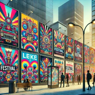
- Vibrant festival posters that capture attention in urban settings.
- Sleek, minimalist packaging for luxury cosmetics.

Creative Solutions Across Media and Markets
Enhancing Brand Visibility and Consumer Engagement
In today’s saturated visual world, where a million brands whisper or shout for our attention, the soul of a brand is most clearly expressed not in slogans but in its visual presence. Graphic design, in this regard, becomes the architect of identity—carving out space in the public imagination, shaping how a company or cause is perceived, remembered, and embraced. It is not simply about making things look attractive; it is about making values visible, missions legible, and stories memorable.
- Overview: Graphic design acts as the primary visual language through which brands interact with the world. From first impressions to lasting associations, it orchestrates the interplay of color, form, typography, and symbolism to shape how audiences feel, think, and respond.
- Key Strategies:
- Developing logos that function as visual signatures—concise, symbolic, and emotionally resonant.
- Creating brand guidelines that ensure aesthetic consistency across brochures, websites, packaging, and social media, building trust through familiarity.
- Infusing marketing materials with narrative coherence so that every image, font, and layout aligns with a deeper brand story.
- Utilizing responsive design to adapt visual content gracefully across devices and platforms, reinforcing omnipresent identity.
- Examples:
- Nike’s iconic “swoosh” is more than a shape—it is kinetic identity, a curve of momentum that communicates ambition, motion, and power. Coupled with their empowering visual campaigns, it encapsulates brand ethos in a single stroke.
- Independent brands like Glossier rely on minimalist Instagram graphics, pastel tones, and curated typography to convey an ethos of self-care and approachability, inviting user-generated content that reinforces a sense of community.
Supporting Marketing and Advertising Campaigns
Marketing without design is a story without a script—raw and wandering. In campaigns that aim to connect, persuade, and convert, graphic design brings emotional resonance to data, clarity to intention, and memorability to messages. It gives form to the intangible: ambition, excitement, urgency, humor, and trust.
- Overview: Graphic design serves as the creative engine powering the visual dimension of campaigns. Whether the medium is print, digital, or environmental, effective design transforms concepts into visceral experiences—ones that are not only seen but felt.
- Applications:
- Designing multi-platform advertisements that adapt to different audience touchpoints—TV commercials, social reels, banner ads, subway posters.
- Composing visual storytelling for social media—carousels, animated GIFs, video thumbnails—that amplify brand personality and maintain user engagement.
- Structuring promotional materials such as newsletters, pop-up graphics, and eBook layouts that seamlessly merge content with aesthetics.
- Examples:
- Apple’s product launches are design symphonies: meticulously choreographed keynotes, immersive digital visuals, and minimalist advertisements that convey technological elegance through visual silence and precision.
- Spotify Wrapped’s yearly campaign, combining vibrant graphics and personalized statistics, turns user data into celebratory visuals—transforming a product feature into viral culture.
Improving User Experience in Digital Platforms
User experience (UX) is the art of invisible care. A well-designed interface is like good architecture—it does not call attention to itself, but it makes every movement through it fluid and satisfying. In the digital realm, graphic design does not merely decorate a platform; it sculpts it. It clarifies function, highlights choices, and reduces friction while preserving beauty.
- Overview: Graphic design enhances digital interactions by turning complexity into simplicity, chaos into order. It brings coherence to UI components and accessibility to diverse users, ensuring that design does not privilege form over function—but that the two become one.
- Applications:
- Designing intuitive interface layouts that follow cognitive patterns and reduce user learning curves.
- Implementing accessibility best practices—high-contrast color schemes, scalable fonts, alt-text for visuals—to accommodate all users regardless of ability.
- Using micro-interactions—hover effects, animations, feedback cues—to make digital actions feel responsive, human, and satisfying.
- Examples:
- The Airbnb interface, with its clean layout and intuitive filters, enhances the sense of exploration while minimizing cognitive load, allowing users to feel in control while browsing.
- Language-learning platforms like Duolingo use bright illustrations, gamified progress bars, and playful icons to make learning feel like an adventure, not a task.
Across markets and mediums, graphic design proves itself not merely as a craft of visuals, but as a language of connection. Whether amplifying brand identity, driving advertising performance, or humanizing digital experiences, design threads intention through form. In a world oversaturated with content, it is thoughtful, elegant, and strategic design that turns messages into meaning and encounters into relationships.
Trends Shaping the Modern Design Landscape
- 3D Design and Animation: Depth Beyond the Flat Surface
- Overview: In an age increasingly defined by digital immersion, 3D design and animation have become portals to alternate realities—realms where motion breathes life into form, and depth adds dimension to ideas. Gone are the days when visuals sat still on a screen. Today, they move, rotate, morph, and respond. With advances in rendering engines, user interfaces, and hardware capabilities, 3D design has transcended novelty to become a core language of digital storytelling and product visualization.
- Expanded Applications:
- In e-commerce, animated 3D product demos allow users to inspect every curve and function of an item, building trust and engagement without needing physical contact.
- Architectural visualizations simulate lighting, movement, and environmental context, making proposals more persuasive and experiential.
- Entertainment and gaming industries employ 3D motion graphics not merely for spectacle but to construct richly layered worlds that transport users into interactive narratives.
- Corporate branding videos now integrate kinetic typography, morphing logos, and animated transitions to energize brand communication.
- Examples:
- Apple’s product launches frequently incorporate 3D animation to present internal hardware design and seamless user experiences through elegant motion sequences.
- Luxury fashion houses such as Balenciaga have hosted entirely 3D virtual runway shows, where garments and models exist solely in simulated environments.
- Minimalist and Clean Aesthetics: The Elegance of Restraint
- Overview: Amid the clutter of modern media, minimalism stands as a visual form of meditation. It suggests that clarity is not the absence of design but the distillation of it. Rooted in the principle that “less is more,” minimalist aesthetics prioritize function, legibility, and elegance. It’s a style where every line, shape, and space must justify its existence—not as decoration, but as meaning.
- Expanded Applications:
- UX/UI interfaces employ white space, neutral tones, and structured grids to reduce visual noise, guiding the user’s eye with silent precision.
- Corporate identity systems simplify logos down to elemental forms—circles, lines, and letters—that are easily scalable and instantly recognizable.
- Editorial design embraces negative space and monochromatic schemes to place focus squarely on content and narrative.
- Product packaging is increasingly leaning toward biodegradable, single-color wraps with minimal text—emphasizing purity and ecological awareness.
- Examples:
- Google’s Material Design simplifies app interfaces with clean layouts and intuitive icons that enhance usability while preserving aesthetic clarity.
- Fashion brands like COS and MUJI use minimal color palettes and typography in their digital and print media, projecting timelessness and calm.
- Sustainable Design Practices: Ethics in Aesthetics
- Overview: As the environmental consequences of production come into sharper focus, design is evolving from a tool of persuasion to a force of stewardship. Sustainable design embraces the ethical responsibility of creators to consider the lifecycle of their work—from materials sourced to waste generated. It is a philosophy rooted in humility: the belief that every choice, even in pixels or packaging, leaves an imprint on the planet.
- Expanded Applications:
- Packaging designers are opting for recycled paper, biodegradable ink, and reusable materials to minimize ecological harm.
- Digital-first branding campaigns aim to eliminate print waste altogether by optimizing assets for screens and devices.
- Exhibition designers are creating modular, reusable displays that minimize single-use construction and embrace circular design.
- Fonts and color schemes are chosen not only for visual appeal but also for energy efficiency—darker screens save power, especially on OLED displays.
- Examples:
- Brands like Patagonia use sustainable design principles in both marketing and product design, reinforcing a commitment to environmental activism.
- The AIGA Sustainable Design Resources portal provides designers with frameworks and tools to incorporate environmental responsibility into their creative process.
- Interactive and Immersive Experiences: The New Canvas of Participation
- Overview: The modern viewer is no longer satisfied to simply observe—they want to interact, explore, and influence the content they engage with. Graphic design, once bound by static form, is now increasingly dynamic, adaptive, and participatory. This shift toward immersion transforms users into co-creators, inviting them into stories rather than merely showing them.
- Expanded Applications:
- Interactive infographics respond to cursor hovers and clicks, revealing layers of information in digestible, engaging ways.
- Augmented Reality (AR) design overlays digital visuals onto the physical world, blending imagination with tangible experience.
- Microsites for product launches feature gamified user journeys, unlocking content as users progress through the story.
- Virtual exhibitions and digital art galleries replicate the spatial immersion of physical venues while enabling global accessibility.
- Examples:
- The New York Times has pioneered interactive journalism, with scrolling visuals, embedded animations, and live data visualizations enhancing reader comprehension.
- Brands like IKEA have developed AR apps that let users preview furniture in their homes before purchasing, merging design with real-world utility.
In each of these trends—be it the spatial wonder of 3D, the serenity of minimalism, the conscience of sustainability, or the immersion of interactivity—we find graphic design evolving not just as a visual craft but as a cultural force. These movements do not compete; they co-exist, informing one another in a dynamic interplay that reflects our shifting relationships with media, space, and self. What unites them is a single, timeless aim: to make meaning visible.
The Struggles to Satisfy the Rapid Changing Client Expectations
- Balancing Creativity and Functionality
- In the world of graphic design, every project begins as a blank canvas—full of promise, yet bounded by purpose. Designers are not merely visual poets; they are also silent engineers of experience. The challenge lies in harmonizing beauty with usability, evoking emotion while maintaining clarity, and surprising the viewer without sacrificing coherence. A website may dazzle with its color palette and motion, but if a user cannot find the contact button, the art has failed its function. This tension between the expressive and the practical is not a flaw—it is the crucible where great design is forged. The most powerful designs are those that wear their complexity lightly, guiding users intuitively while whispering aesthetic delight. Like a well-composed symphony, the harmony between form and purpose must feel inevitable, even if it took dozens of drafts to achieve.
- Staying Updated with Technology
- The tools of design evolve at breakneck speed, with new software, AI-powered assistants, and interactive formats emerging seemingly overnight. Designers today must be more than artists; they must also be technologists, adaptable navigators in a landscape shaped by innovation. Staying relevant requires constant learning—not merely of new techniques, but of new paradigms. For example, motion design now includes real-time rendering engines. Typography is no longer static; it's responsive. Layouts bend and reshape themselves depending on device, screen size, and user input. In this climate, stagnation is not an option. Designers who rest on yesterday’s skills risk being eclipsed by the pace of change. Yet the wise designer doesn’t chase every trend—they discern which technologies amplify their vision and which distract. Mastery now includes the humility to remain a student, always curious, always evolving.
- Maintaining Brand Consistency
- A brand is not a logo, a slogan, or a typeface—it is a story told again and again, consistently and compellingly, across time and space. For designers, the struggle is to preserve this continuity without becoming repetitive, to innovate within the aesthetic boundaries that define an identity. Each project—whether a packaging label, website, or social post—must align with the larger narrative while still feeling fresh and alive. This requires discipline, attention to detail, and deep understanding of the brand's essence. Even small inconsistencies—a misaligned grid, an off-brand hue, a misplaced voice—can weaken trust. In a saturated world, consistency is not limitation; it is resonance. It is the echo that reassures, the rhythm that returns. Designers are the stewards of this rhythm, crafting experiences that speak in one voice, even when told through a thousand mediums.
- Adapting to Client Expectations
- One of the most delicate struggles in graphic design lies in the relationship between vision and expectation—between what the designer sees and what the client hopes to see. Clients arrive with dreams, constraints, reference boards, and sometimes contradictions. Designers must decode this input, read between the lines, and gently shape expectations without shattering enthusiasm. This dance is not about compromise, but convergence: finding a shared vision that honors both the designer’s craft and the client’s goals. It requires empathy, diplomacy, and a flexible ego. The best designers know when to push, when to yield, and when to ask the right question. They do not simply deliver files; they build relationships founded on clarity and respect. And when it works, the outcome is more than just “on-brand”—it becomes something greater than either party could have created alone.
Imagining the Next Wave of Visual Design
- Artificial Intelligence in Design
- As the digital realm expands into ever more intricate layers of interaction and automation, AI-powered tools have emerged not merely as aids but as creative partners. These systems now do more than perform repetitive design tasks—they participate in the generative process, offering stylistic suggestions, completing visual patterns, and forecasting audience responses. Designers are no longer limited by the constraints of their own technical bandwidth; instead, they can delegate the mundane to intelligent algorithms while reserving their energies for conceptual innovation and narrative depth. This democratization of creation does not signify a loss of artistic soul; rather, it signals a shift in the locus of authorship, where human imagination and machine precision dance in tandem. With time-saving automation, intelligent layout prediction, color palette harmonization, and even brand voice adaptation, AI expands the boundaries of what can be ideated, iterated, and implemented within tight production cycles.
- Focus on Accessibility
- The visual world is no longer designed solely for the able-bodied viewer with perfect vision, flawless hearing, or fluent digital literacy. A quiet revolution is underway, where accessibility is no longer treated as a checklist obligation but as an ethical cornerstone of design philosophy. Creating inclusive visual experiences means acknowledging a broader human spectrum—considering not just sight but perception, not just interaction but understanding. Graphic designers are increasingly employing strategies such as high-contrast themes for low-vision users, alt-text descriptions for screen readers, clear font hierarchies for cognitive accessibility, and keyboard navigability for those with motor impairments. These efforts align deeply with human-centered design principles, transforming empathy from an abstract virtue into a tangible outcome. By integrating accessibility from the beginning of the design process, not retrofitting it as an afterthought, designers become architects of equity. They foster participation in the public and digital spheres for people historically excluded, turning design into a silent act of justice.
- Personalized Design Solutions
- In an age of overwhelming information, personalization is the antidote to digital anonymity. Personalized design, powered by behavioral data and user preferences, is transforming static aesthetics into dynamic experiences. No longer is a design meant to serve the hypothetical “average user”; instead, it adapts to specific patterns—what you click, when you scroll, which palette soothes your eyes, what tone earns your trust. The designer becomes a kind of cartographer of emotional and behavioral terrain, mapping out user journeys that feel serendipitously intuitive. Whether in ecommerce banners that recall your tastes or educational infographics that adjust complexity based on reading levels, personalization imbues content with a living pulse. Ethical concerns about surveillance capitalism must be weighed seriously, but when done with consent and care, data-informed design enhances relevance and dignity. It brings forth a paradigm where the screen doesn’t simply display—it converses, listens, and reflects the individual’s inner preferences back to them in meaningful ways.
- Integration with Emerging Technologies
- As we traverse into hybrid realities, where the digital bleeds into the physical and vice versa, graphic design is evolving beyond the flat canvas. Immersive technologies like virtual reality (VR), augmented reality (AR), and extended reality (XR) offer radical new environments for visual expression. In these spaces, designers must not only consider layout and color—but spatiality, interactivity, and sensory immersion. A poster is no longer just a flat print; it can now become an experience you step into, an augmented mural that reacts to your gaze or gestures. From virtual brand stores and AR-enhanced product packaging to interactive exhibitions in the metaverse, the visual language of tomorrow is increasingly multidimensional. These technologies allow designers to become orchestrators of experience, creating not just images but entire universes of feeling and meaning. This shift does not negate the past; it builds upon centuries of aesthetic exploration while demanding a new fluency in code, motion, and spatial design. The challenge is not simply to adopt the new—but to infuse it with human warmth, ethical grounding, and timeless beauty.
Design That Communicates: The Value of Studying Graphic Design
Communicating Visually and Effectively
Combining Creativity with Strategic Thinking
Mastering Tools and Techniques
Enhancing User Experience and Brand Identity
Building a Future-Proof Creative Career
From Pixels to Possibility: Final Reflections on the Essence of Graphic Design
Graphic Design – Frequently Asked Questions
What is Graphic Design as a university subject?
Graphic Design is the study and practice of visual communication: how to turn messy information into clear, persuasive, and readable messages. At university level, you learn design thinking, typography, layout, image-making, branding, and digital design—while also examining how design influences culture, behaviour, and trust.
How is Graphic Design different from Fine Arts?
Fine Arts is usually more open-ended and self-directed, often exploring personal themes without needing a “client” or communication goal. Graphic Design is typically purpose-driven: it solves communication problems for audiences, organisations, and products. Both can be creative and experimental, but graphic design is judged heavily by clarity, usability, and whether the message works in real contexts.
Do I need to be good at drawing to study Graphic Design?
Drawing helps, but it is not a requirement. Many strong designers are not “traditional sketch artists.” What matters more is visual thinking: composition, hierarchy, typography sensitivity, and the ability to explore ideas quickly. Your portfolio can show thinking through thumbnails, layout experiments, type studies, photo work, collage, UI mockups, or simple icon systems.
What will I actually do in a Graphic Design degree?
You will build projects that look like professional design briefs: identity systems, posters, editorial layouts, packaging, motion/social formats, and digital interface prototypes. Along the way you practise research, concept development, iteration, critique, presentation, and production skills (print and screen).
What kinds of software will I be expected to learn?
Most programmes expect you to become comfortable with standard tools for layout, vector graphics, and image editing. The specific brands vary, but the transferable skills matter more: grids, type control, file hygiene, export settings, colour management, and working non-destructively. Many schools also introduce UI/UX prototyping tools and basic motion workflows.
What does a Graphic Design portfolio usually include?
A strong portfolio usually shows 6–12 projects with process—not only final images. Include research notes, sketches, rejected directions, typographic explorations, grid tests, and before/after refinements. Admissions tutors (and employers) want evidence that you can think, iterate, and justify decisions, not only “make it look nice.”
How much typography is involved, and why is it so important?
Typography is often the backbone of graphic design because text is where meaning lives. You will learn hierarchy, spacing, alignment, legibility, and how type carries tone (formal, playful, urgent, calm). Good typography can rescue weak visuals; poor typography can ruin strong visuals. It is also one of the fastest ways for your work to look professional.
Is Graphic Design mainly about logos and branding?
Branding is one major area, but graphic design is broader: posters, editorial design, information graphics, packaging, wayfinding, web and app design, presentation systems, and content for social platforms. In many jobs, you spend as much time designing systems (templates, rules, grids) as you do designing “hero” visuals.
How do critique sessions work in Graphic Design?
Critique is a structured conversation about whether your design communicates effectively. Instead of “I like it” or “I don’t like it,” people discuss audience fit, hierarchy, readability, consistency, and how well the design matches the brief. The goal is not to attack your taste; it is to give you sharper next steps for improvement.
What’s the relationship between Graphic Design and UX/UI design?
They overlap, but they are not identical. Graphic design focuses strongly on visual language—type, composition, identity, and messaging—across print and digital contexts. UX/UI focuses on interaction: user goals, flows, usability, and behaviour across screens. Many modern designers blend both, so learning basic UX thinking often strengthens graphic design work.
How have social media and short-form platforms changed graphic design?
Design now needs to work across multiple formats (16:9, 9:16, square), often with motion, subtitles, and rapid attention windows. Designers must think in systems: templates, style rules, and content variations—so the message stays consistent even when the platform changes the “frame.” This has also increased the importance of accessibility and readability on small screens.
What careers can Graphic Design graduates pursue?
Graduates work in branding studios, marketing and communications teams, publishing, packaging, product design teams, UI/UX roles, motion/social content, and creative technology. Some become freelancers or start small studios. The transferable core is the ability to communicate clearly, build visual systems, and deliver work reliably under constraints.
Is Graphic Design a “stable” career, and how do people make it sustainable?
It can be stable, but it rewards adaptability. Many designers build sustainability by strengthening fundamentals (type, layout, systems), keeping a portfolio current, learning production details, and developing communication skills with clients and teams. Some combine design with related strengths such as writing, motion, front-end basics, or research—so they can contribute across projects.
What should I do now (before university) to prepare for Graphic Design?
Build a simple habit: remake existing designs as practice, then redesign them with one clear improvement goal (better hierarchy, stronger grid, clearer type, more consistent spacing). Start a small portfolio of 6–8 projects with process screenshots. Learn to explain your decisions in plain language: audience, message, constraints, and why your layout choices help.
Is Graphic Design Right For You?
Explore career pathways, check your fit, and assess your skills — before you commit to a degree.
Thinking Visually: Practice Questions in Design
- What is graphic design?
Answer: Graphic design is the art of visual communication that uses typography, imagery, and layout to convey ideas and messages effectively across many media.
- How does graphic design contribute to building a brand identity?
Answer: It creates a cohesive visual language through logos, color schemes, typography, and layout rules that build recognition, trust, and differentiation over time.
- What are the primary applications of digital design?
Answer: Digital design includes interfaces, websites, social media content, motion-friendly assets, and interactive graphics that improve usability and engagement on screens.
- How do print media and digital media differ in graphic design?
Answer: Print design is fixed and physical, involving paper size, ink, and finishing. Digital design must adapt to screens, including responsive layouts, scrolling, accessibility, and interaction.
- What role does storytelling play in graphic design?
Answer: Storytelling helps design guide attention in a meaningful sequence, using visuals and hierarchy to shape emotion, context, and memory, not just decoration.
- How can designers ensure consistency across various visual platforms?
Answer: Designers can use a design system or brand guidelines that define color, type styles, spacing, image style, templates, and “do/don’t” rules across formats.
- What challenges might designers face when integrating emerging technologies?
Answer: They must learn new tools, manage technical constraints, keep experiences usable, and avoid novelty that weakens clarity, especially in AR, VR, or AI-assisted workflows.
- How do aesthetic principles such as balance and contrast enhance design?
Answer: They create structure, guide the eye, and improve readability, helping viewers quickly detect what matters most and why.
- Why is user experience (UX) important in graphic design?
Answer: UX ensures designs are not only attractive but also understandable and easy to use, reducing confusion and increasing successful actions such as reading, clicking, buying, or learning.
- How does graphic design influence consumer behavior?
Answer: Design shapes first impressions, trust, and emotional tone, which affects attention, perceived quality, and willingness to engage or purchase.
- What is visual hierarchy, and why does it matter?
Answer: Visual hierarchy is the ordering of information by importance using size, weight, spacing, and contrast, so viewers can scan quickly and understand the message.
- Why is typography considered a “core tool” in design?
Answer: Type controls clarity and tone. Good typography improves legibility, builds personality, and makes information feel organised and credible.
- How do grids and alignment improve layouts?
Answer: Grids create rhythm and consistency, making layouts easier to read and helping elements relate logically rather than floating randomly.
- What does accessibility mean in graphic design?
Answer: Accessibility means designing so more people can use and understand content through readable type, strong contrast, clear structure, captions, alt text, and inclusive choices.
- What is the difference between a logo and a full visual identity?
Answer: A logo is one symbol. A visual identity is the whole system of type, color, imagery, layout rules, and templates that keeps communication consistent everywhere.
- Why is iteration important in the design process?
Answer: Iteration allows designers to test ideas, get feedback, refine hierarchy and clarity, and improve outcomes, turning a first draft into a reliable solution.
Layout Decisions That Make a Design Feel “Professional”
A. Hierarchy: Decide the Reading Order on Purpose
- One hero: the title or key message must win instantly through size, weight, or contrast.
- One path: guide the eye from hero → support → details. Spacing and alignment do most of the work.
- One quiet zone: leave breathing room so the message has somewhere to “land”.
B. Spacing: Use Fewer Values, Not More
- Micro: tight spacing within a component, such as label + value.
- Normal: spacing between related items, such as bullet list items.
- Macro: spacing between sections, such as a headline block and body block.
C. Alignment: Make Edges Behave
- Choose a main edge: usually left-aligned for readability, especially on web pages.
- Snap to a grid: if an element is “almost aligned,” it will look wrong every time.
- Limit centering: center alignment is best for short headline blocks, not long paragraphs.
D. Type Pairing: Keep It Simple, Make It Intentional
- Two fonts max: often, one font family is enough.
- Use contrast correctly: if two styles are different, make them clearly different through size, weight, or spacing.
- Watch line length: body text is easiest to read when line length is controlled.
Design Critique Without the Drama
- Start with intent: What should the viewer understand or do in 3 seconds?
- Check hierarchy: What is seen first, second, and third? Is that order correct?
- Test readability: Step back. Shrink it. View it in grayscale. If it breaks, fix structure before decoration.
- Ask for one change: What is the single change that would improve clarity the most?
Design Beyond Aesthetics: Questions That Make You Think
- How might emerging technologies like augmented reality transform traditional graphic design?
Answer: Augmented reality can overlay digital visuals onto the physical world, offering interactive and immersive experiences. This could change how designers create dynamic, engaging visuals that blend physical and digital realities.
- In what ways does cultural context shape the visual language of graphic design?
Answer: Cultural context influences color choices, symbols, and aesthetics, helping designs resonate with local traditions and values while also appealing to a global audience.
- How can graphic design drive social change and awareness?
Answer: By using compelling visuals and narratives to highlight social issues, graphic design can provoke discussion, inspire activism, and mobilize communities.
- What is the impact of minimalism in graphic design, and why is it so popular today?
Answer: Minimalism reduces visual clutter and focuses attention on essential elements. Its popularity comes from its ability to create clear, modern designs that improve user experience and brand communication.
- How can designers balance innovation with maintaining brand consistency?
Answer: Designers can innovate within established brand guidelines, experimenting with new techniques while keeping core visual elements consistent enough to preserve identity.
- What role does user feedback play in the evolution of graphic design practices?
Answer: User feedback provides insights into audience preferences and usability, helping designers refine their work, improve engagement, and meet user needs more effectively.
- How might sustainability influence the future of graphic design, especially in print media?
Answer: Sustainability encourages designers to adopt eco-friendly materials and processes, reduce waste, and create digital-first campaigns where appropriate.
- In what ways does storytelling in graphic design create emotional connections with audiences?
Answer: Storytelling through visuals, color, and composition can evoke emotions, trigger memories, and build empathy, allowing audiences to connect with the message more deeply.
- How can graphic design adapt to an increasingly digital and mobile-first world?
Answer: Designers must focus on responsive design, optimize visuals for different screen sizes, and create engaging interactive elements suited to mobile habits.
- What challenges do designers face when working across diverse media platforms, and how can they overcome them?
Answer: Challenges include varying display resolutions, color differences, and platform-specific user behaviors. Designers can address these through testing, adaptable design systems, and a strong understanding of each medium’s technical requirements.
- How might data analytics reshape creative decision-making in graphic design?
Answer: Data analytics provide insights into engagement, conversion rates, and market trends, helping designers make evidence-based decisions while still protecting creativity and clarity.
Solving Design Problems with Math
1. A graphic designer is tasked with creating a poster that measures 24 inches by 36 inches. Convert these dimensions to centimeters.
Solution:
1 inch = 2.54 cm
24 inches = 24 × 2.54 = 60.96 cm
36 inches = 36 × 2.54 = 91.44 cm
Answer: The poster dimensions are 60.96 cm by 91.44 cm.
2. An infographic is designed for a web page with a width of 1200 pixels. If the height is set to maintain an aspect ratio of 16:9, what is the height in pixels?
Solution:
Aspect ratio 16:9 means height = (9 / 16) × width.
Height = (9 / 16) × 1200 = 675 pixels
Answer: The height is 675 pixels.
3. A brochure design includes a full-bleed image that spans 10 inches in width. If the printer requires a 0.125-inch bleed on all sides, what should be the total width of the image including bleed?
Solution:
Bleed on both sides = 0.125 × 2 = 0.25 inches
Total width = 10 + 0.25 = 10.25 inches
Answer: The total width should be 10.25 inches.
4. A digital poster is created at 300 DPI and measures 18 inches by 24 inches. Calculate the total number of pixels in the poster.
Solution:
Width = 18 × 300 = 5400 pixels
Height = 24 × 300 = 7200 pixels
Total pixels = 5400 × 7200 = 38,880,000 pixels
Answer: The poster contains 38,880,000 pixels.
5. A website redesign project aims to reduce the file size of images by 35%. If an original image is 8 MB, what is its new file size after compression?
Solution:
Reduction = 0.35 × 8 = 2.8 MB
New file size = 8 − 2.8 = 5.2 MB
Answer: The new file size is 5.2 MB.
6. An advertisement campaign uses a graphic that is 1200 pixels wide. If the graphic is scaled down by 25%, what is the new width in pixels?
Solution:
25% of 1200 = 0.25 × 1200 = 300 pixels
New width = 1200 − 300 = 900 pixels
Answer: The new width is 900 pixels.
7. A graphic design course has 25 students. If each student must complete 4 projects and each project takes an average of 12 hours to complete, how many total hours of project work are required?
Solution:
Total hours = 25 × 4 × 12 = 1200 hours
Answer: The total project work required is 1200 hours.