
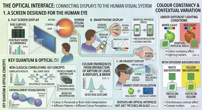
Part 1: A Screen Designed For The Human Eye
The central panel illustrates the physical and physiological connection between different displays and the user’s visual system:- Human Visual System Model: A detailed model of the human eye and brain is positioned at the top-left, with labels for ‘RETINA’, ‘CORNEA’, ‘LENS’, and neural paths leading to a brain ‘VISUAL CORTEX’. Three main display types are arranged around it, each connected by visual paths:
- A. Flat Screen Display: Shows a user looking at a wall-mounted display. Inset zoom boxes and callouts detail: an ‘RGB SUBPIXEL MATRIX’ grid; ‘CONTRAST RATIO & LUMINANCE’ plots with statistical bar charts; and ‘REFRESH FRAMES & MOTION BLUR’ diagrams comparing an ‘INTENDED IMAGE’ versus ‘PERCEIVED IMAGE’ waveform, linked to ‘BRAIN SIDE INTERPRETATION’.
- B. Smartphone Display: Shows a user holding a phone. Diagrams and arrows detail: ‘VIEWING DISTANCE’ and ‘ANGULAR SIZE (θ)’ on the retina, linked to ‘RETINAL CONE DENSITY’ (labeled Red, Green, Blue types) and sensitivity curves. Insets compare an ‘IDENTICAL PHYSICAL PATCH’ (green square) at different distances with bullet points noting ‘ANGULAR RESOLUTION’ and ‘DISTANCE MATTERS’.
- C. AR Headset Display: Shows a user wearing an AR headset. Detailed schematics trace ‘VIRTUAL RAYS’ entering the eye to form a ‘DIGITAL OVERLAY’ and a transparent ‘VIEW OF REAL-WORLD OBJECTS’ behind it. A central note argues: ‘AR DISPLAYS CREATE NON-LOCAL SUPERPOSITIONS OF DIGITAL & PHYSICAL CONTENT’. Callout diagrams visualize this superposition as a ‘SHARED STATE VISUALIZATION’, combining a ‘REAL OBJECT’ (green apple) with ‘DIGITAL AR CONTENT’ (blue text/symbols) along shared indigo-green twisted wavelines.
Part 2: Integrated Contextual Variation and Quantum Concepts
Flanking panels integrate related visual effects and concepts:- “COLOUR CONSTANCY & CONTEXTUAL VARIATION” (Right panel): This panel uses two subsections to explore perceptual shifts:
- Under Different Lighting Conditions: Shows a green apple under ‘WHITE LIGHT’ and ‘RED LIGHT’ with identical physical patches appearing differently colored, with callouts for ‘Colour constancy effect’ and ‘Lighting matters’.
- With Different Backgrounds: Shows identical green patches on a ‘WHITE BACKGROUND’ and a ‘YELLOW BACKGROUND’. Zoom callouts magnify ‘PATCH ON WHITE’ and ‘PATCH ON YELLOW’, with bullet points for ‘Simultaneous contrast effect’ and ‘Context matters’.
- “KEY QUANTUM & OPTICAL CONCEPTS” (Left panel): Incorporates fundamental quantum physics principles:
- Non-Classical Correlations: Key Concepts: Displays a ‘CORRELATED RESULTS’ histogram and ‘BELL-STATE CHECK’ diagrams with probability callouts.
- Entanglement Visualization: An ‘ENTANGLEMENT VISUALIZATION’ graphic showing shared quantum-state twisted waves connected by glowing arcs labeled ‘SHARED QUANTUM-STATE |Ψ⟩’.
The Evolutionary Path: History, System Barriers, and Foundry Paradigms
The Historical Journey
Contemporary Technical Hurdles
Future Paradigms: Waveguide Optoelectronic Integration and Foveated Layouts
- Diffractive Waveguide Engines: To inject clear virtual images into an open view, hardware developers etch microscopic surface patterns onto thin glass layers. These structural gratings guide light via total internal reflection before angling it toward the eye box, enabling transparent AR glasses that merge physical and digital paths.
- Eye-Tracked Foveated Systems: Capitalizing on the high density of cone cells in the human fovea, display systems are integrating compact infrared eye-tracking cameras. This allows the system to render high resolution only where the user is looking, reducing processing demand while providing a clear and responsive display experience.
What Displays and AR Have to Do with Human Vision
Pixels, Subpixels, and Image Formation
| Display Element | Meaning | Human-Vision Connection |
|---|---|---|
| Pixel | Smallest addressable picture element | Determines visible image detail with viewing distance |
| Subpixel | Red, green, blue, or other smaller light component inside a pixel | Supports colour mixing and fine text rendering |
| Pixel density | Number of pixels per unit length or area | Affects sharpness at a given viewing distance |
| Resolution | Total number of pixels across the display | Affects detail, but only meaningful with screen size and viewing distance |
| Viewing distance | Distance between eye and display | Determines angular size of pixels and text |
RGB Displays and Additive Colour
| RGB Combination | Typical Perceived Result |
|---|---|
| Red + green | Yellow-like colour |
| Green + blue | Cyan-like colour |
| Blue + red | Magenta-like colour |
| Red + green + blue | White or near-white, depending on balance |
| All channels low | Dark grey or black-like appearance |
Resolution, Pixel Density, and Angular Size
| Situation | Optical Effect | Design Meaning |
|---|---|---|
| Small screen viewed close | Pixels subtend larger angles | Higher pixel density may be needed |
| Large screen viewed far away | Pixels subtend smaller angles | Lower pixel density may still look acceptable |
| Text-heavy display | Small edges and strokes must remain readable | Sharp rendering and contrast matter |
| AR near-eye display | Virtual pixels are projected into the visual field | Angular resolution and optics are critical |
Brightness, Luminance, and Contrast
| Display Property | Meaning | Human-Vision Relevance |
|---|---|---|
| Luminance | Light output in a direction | Affects perceived brightness and visibility |
| Contrast ratio | Difference between bright and dark levels | Affects readability, detail, and visual comfort |
| Black level | How dark the display can appear | Affects depth, shadow detail, and image richness |
| Glare | Unwanted reflected or scattered light | Can reduce visibility and comfort |
| Ambient light | Light in the surrounding environment | Changes how the display appears |
Contrast Accessibility
| Design Issue | Better Practice |
|---|---|
| Low-contrast text | Use stronger foreground-background contrast |
| Colour-only meaning | Add labels, icons, patterns, or position cues |
| Small thin fonts | Use adequate size, weight, spacing, and contrast |
| Important warnings | Use colour plus text, shape, and clear placement |
| Complex charts | Make categories distinguishable without colour alone |
Refresh Rate and Motion
| Term | Meaning | Human-Vision Effect |
|---|---|---|
| Refresh rate | How often the display updates | Affects smoothness and flicker perception |
| Frame rate | How many unique frames are generated per second | Affects motion continuity |
| Response time | How quickly pixels change state | Affects blur or ghosting |
| Latency | Delay between input and visual response | Affects interaction comfort and control |
| Persistence | How long a frame remains visible | Affects motion clarity |
Flicker, Pulse-Width Modulation, and Comfort
High Dynamic Range and Tone Mapping
| HDR Idea | Simple Meaning | Visual Design Concern |
|---|---|---|
| Peak brightness | Maximum bright highlight level | Can improve realism but may cause glare if overused |
| Black level | Darkest display output | Supports shadow detail and contrast |
| Tone mapping | Mapping content brightness to display capability | Preserves detail without looking unnatural |
| Viewing environment | Room lighting and reflections | Changes perceived contrast and comfort |
Colour Gamut and Calibration
| Display Colour Term | Meaning |
|---|---|
| Colour gamut | Range of colours a display can produce |
| White point | The display’s reference white appearance |
| Gamma | Relationship between input signal and displayed brightness |
| Calibration | Adjustment toward known display behaviour |
| Colour management | System for keeping colour consistent across devices |
Viewing Distance and Text Readability
Displays and Eye Comfort
| Comfort Factor | Why It Matters |
|---|---|
| Viewing distance | Affects focus demand, angular size, and posture |
| Text size | Small text increases visual effort |
| Contrast | Low contrast makes reading harder |
| Glare and reflections | Reduce visibility and may increase discomfort |
| Ambient lighting | Changes display visibility and pupil size |
| Motion and refresh behaviour | Can affect comfort in scrolling, gaming, VR, and AR |
| Visual correction | Uncorrected refractive errors may make screen tasks harder |
Blue Light: What Students Should Understand
Augmented Reality: Adding Digital Images to the Real World
| AR Requirement | Why It Matters |
|---|---|
| Registration | Virtual objects should align with real-world objects |
| Tracking | The system must follow head, hand, or eye movement |
| Brightness control | Virtual objects must remain visible under changing real-world light |
| Field of view | Determines how much digital content fits into the visible scene |
| Depth cues | Help the brain place virtual objects at believable distances |
| Latency | Delay can disturb alignment and comfort |
Near-Eye Displays
Waveguides, Combiners, and Transparent Displays
| Optical Component | Role in AR | Design Challenge |
|---|---|---|
| Waveguide | Guides display light through a transparent optical path | Brightness, colour uniformity, efficiency, and field of view |
| Combiner | Combines virtual image light with real-world light | Maintaining transparency and image quality |
| Microdisplay | Generates the source image | High resolution in a very small area |
| Projection optics | Forms virtual image for the eye | Focus, distortion, eye box, and comfort |
| Eye box | Region where the eye can receive the image | Must allow natural eye and headset movement |
Vergence, Accommodation, and AR Comfort
| Visual Process | Meaning | Why It Matters in AR |
|---|---|---|
| Vergence | Eyes rotate to point at a perceived depth | Supports binocular depth perception |
| Accommodation | Eye lens changes focus distance | Supports sharp retinal image formation |
| Vergence-accommodation conflict | Vergence and focus cues disagree | Can affect comfort and performance in some near-eye displays |
| Varifocal display | Changes focus distance dynamically | One possible approach to reducing conflict |
Field of View and Peripheral Vision
| Visual Region | Main Strength | Display Design Implication |
|---|---|---|
| Central vision | Fine detail and reading | Best for text, icons, and precise tasks |
| Peripheral vision | Motion, awareness, broad scene context | Useful for alerts but easy to overload |
| Full visual field | Immersion and spatial awareness | Requires careful optical and interaction design |
Latency, Tracking, and Motion Sickness
Eye Tracking and Foveated Rendering
Displays, AR, and Accessibility
| Accessibility Issue | Better Design Response |
|---|---|
| Colour vision differences | Use labels, shapes, icons, and contrast in addition to colour |
| Low vision | Support scaling, strong contrast, clear fonts, and reduced clutter |
| Motion sensitivity | Allow reduced motion and avoid unnecessary animation |
| Reading difficulty | Use clear hierarchy, spacing, line length, and font choices |
| AR clutter | Place only necessary information in the user’s visual field |
| Bright environments | Ensure readability under glare and changing illumination |
Human-Computer Interaction and Visual Design
AR Information Overload
| AR Design Risk | Possible Consequence | Better Approach |
|---|---|---|
| Too many overlays | Visual clutter and distraction | Show only task-relevant information |
| Poor depth placement | Confusing object location | Align virtual content with meaningful real-world depth |
| Low contrast overlays | Unreadable text in changing light | Adapt contrast and background treatment |
| Blocked real-world view | Reduced safety and awareness | Keep critical real-world areas visible |
| Unstable tracking | Jitter or drift | Improve tracking and avoid precision claims when uncertain |
Applications of Displays, AR, and Human Vision
Education and Learning
Readable displays, clear diagrams, suitable contrast, and accessible colour choices improve learning materials and classroom presentations.
Smartphones and Tablets
Small screens require careful attention to text size, pixel density, brightness, contrast, and touch interaction.
Computer Work
Monitor height, viewing distance, contrast, glare control, text rendering, and font size affect productivity and comfort.
Gaming and Simulation
Refresh rate, latency, motion clarity, field of view, and visual feedback shape performance and immersion.
Augmented Reality
AR overlays digital information onto the real world, requiring careful depth, alignment, optics, contrast, and attention design.
Medical and Scientific Displays
Imaging displays need accurate greyscale, colour, contrast, calibration, and reliable interpretation conditions.
Accessibility Technology
Displays can support larger text, contrast modes, captions, magnification, colour adjustments, and assistive visual interfaces.
Design and Media
Colour, contrast, resolution, dynamic range, and motion strongly influence photography, video, graphic design, and visual storytelling.
Connections with Wider Physics and Technology
Light and Optics
Displays produce and control light through brightness, colour, reflection, refraction, image formation, and optical design.
Geometrical Optics
Near-eye displays, AR lenses, waveguides, and projection systems depend on ray paths, focal distance, and image formation.
Wave Optics
Diffraction, interference, resolution, polarisation, and waveguide behaviour influence advanced display systems.
Photonics
Photonics supports microdisplays, LEDs, lasers, sensors, waveguides, modulators, and optical components in display technology.
The Eye as an Optical System
Display design must respect how the cornea, lens, pupil, retina, fovea, and visual pathway process light.
Colour Vision and Visual Perception
RGB displays, colour accessibility, contrast, adaptation, and perception depend on human colour vision.
Atmospheric and Environmental Optics
Environmental conditions modify light paths and scattering fields before they interact with active near-eye optical panels.
Data Science and Analytics
High-capacity statistical models interpret and parse rapid visual tracking parameters to run complex optimization algorithms.
Artificial Intelligence
Computer vision neural systems coordinate with dynamic hardware pipelines to drive real-world graphic overlays securely.
Human-Computer Interaction and UX
Interface layout, readability, feedback, attention, and visual comfort determine whether display information is usable.
Graphic Design
Typography, colour, layout, contrast, hierarchy, and visual rhythm shape how people interpret screen-based information.
Learning Pathway Within Visual Optics
The Eye as an Optical System
Learn how the cornea, pupil, lens, retina, and optic nerve work together to form images and begin visual perception.
Vision Correction with Lenses
Understand how glasses, contact lenses, and lens power correct myopia, hyperopia, astigmatism, and presbyopia.
Colour Vision and Visual Perception
Explore how cones, wavelengths, colour mixing, contrast, adaptation, and the brain shape human colour vision and perception.
Displays, AR, and Human Vision
Current page. Discover how screens, pixels, refresh rates, contrast, AR optics, eye comfort, and human vision shape modern display design.
Quick Check: Displays, AR, and Human Vision
Quick Check: Human-Centred Displays
Common Misunderstandings About Displays and AR
Misunderstanding 1: More Pixels Always Mean a Better Display
Misunderstanding 2: Brightness Alone Makes a Display Easier to Read
Misunderstanding 3: AR Is Just a Transparent Screen
Misunderstanding 4: Colourful Interfaces Are Automatically Clear
Misunderstanding 5: Human Vision Is Like a Perfect Camera
Key Terms
- Accommodation
- The focusing adjustment of the eye’s lens.
- Augmented reality
- A technology that overlays digital visual information onto the user’s view of the real world.
- Color gamut
- The complete subset of spatial colors that a specific display light engine can physically reproduce.
- Contrast ratio
- A measure of the difference between bright and dark parts of a display or interface.
- Display
- A device or surface that presents visual information using emitted, transmitted, reflected, or projected light.
- Foveated rendering
- A rendering technique that uses high detail near the user’s gaze direction and lower detail in peripheral regions.
- High dynamic range
- A display or content approach that aims to show a wider range of brightness and contrast.
- Latency
- The delay between input, movement, or computation and the visible display response.
- Near-eye display
- A display system placed close to the eye, using optics to form a usable virtual image.
- Pixel
- A small addressable picture element in a digital display.
- Pixel density
- The number of pixels per unit length or area, often affecting perceived sharpness at close viewing distances.
- Refresh rate
- The number of times per second a display updates its image, measured in hertz.
- Resolution
- The total number of pixels used to form an image, often described by width and height.
- Subpixel
- A smaller colour-producing or colour-controlling element within a pixel, often red, green, or blue.
- Vergence
- The inward or outward movement of the eyes to look at objects at different distances.
- Waveguide
- An optical structure that guides light through a thin path, often used in some AR display systems.
Review Questions
- Why are displays connected to human vision?Answer: Displays send light patterns to the eyes. Their success depends on how the human eye and brain interpret pixels, colour, contrast, motion, brightness, and depth.
- What is a pixel?Answer: A pixel is a small addressable picture element that contributes to a digital image.
- Why do many displays use RGB subpixels?Answer: Red, green, and blue subpixels can be mixed additively to produce many perceived colours by stimulating the human cone systems in different combinations.
- Why is viewing distance important for display sharpness?Answer: Viewing distance changes the angular size of pixels and text. The same pixel size appears larger when viewed close and smaller when viewed farther away.
- What does refresh rate measure?Answer: Refresh rate measures how many times per second a display updates its image, usually in hertz.
- What is augmented reality?Answer: Augmented reality overlays digital information onto the user’s view of the real world.
- What is the vergence-accommodation conflict?Answer: It is a mismatch between where the eyes converge and where they focus, often leading to visual fatigue in near-eye displays.
- Why is accessibility important in display design?Answer: Users differ in vision, colour perception, contrast sensitivity, age, and viewing environment. Accessible design makes information clearer and usable for more people.
Thought-Provoking Questions
- Why should display quality be judged by human experience, not hardware specifications alone?Answer: Specifications describe the device, but the user experiences readability, comfort, colour, motion, contrast, and meaning through the human visual system.
- How does AR show that visual design must respect the real world?Answer: AR content must coexist with real objects, real lighting, movement, attention, safety, and depth perception. Poor overlays can distract or confuse users.
- Why might a lower-resolution display still look sharp from far away?Answer: At greater viewing distance, each pixel subtends a smaller visual angle, making the pixel structure harder to resolve.
- Why is colour accessibility a scientific issue as well as a design issue?Answer: It depends on biological differences in colour vision, contrast sensitivity, and perception. Design must respond to how people actually see.
- How might future AR systems become more comfortable?Answer: They may improve by reducing latency, improving tracking, managing depth cues, increasing optical quality, using eye tracking, and addressing vergence-accommodation conflict.
Comprehensive Numerical Problems with Solutions
- A display panel refreshes at a rate of 120 Hz. Calculate the exact time window interval that elapses between sequential refreshes.Solution:The temporal interval represents the reciprocal of the refresh frequency parameter:$$T = \frac{1}{f}$$$$T = \frac{1}{120\text{ Hz}} \approx 0.008333\text{ s}$$Convert to standard milliseconds:$$T = 0.008333\text{ s} \times 1000\text{ ms/s} \approx 8.33\text{ ms}$$Answer: The time interval between updates is exactly 8.33 ms.
- A high-resolution display matrix features a screen width parameter of 0.60 m and contains 1920 pixels across its horizontal track. Compute the net pixel pitch.Solution:Pixel pitch measures the absolute distance length from the center of one pixel element to the next:$$\text{Pixel Pitch} = \frac{\text{Screen Width}}{\text{Horizontal Pixel Count}}$$$$\text{Pixel Pitch} = \frac{0.60\text{ m}}{1920} = 3.125 \times 10^{-4}\text{ m}$$Convert standard meters to millimeters:$$\text{Pixel Pitch} = 3.125 \times 10^{-4}\text{ m} \times 1000\text{ mm/m} = 0.3125\text{ mm}$$Answer: The structural pixel pitch measures precisely 0.3125 mm.
- A smartphone display pixel is 0.30 mm wide and is viewed from a distance parameter of 0.60 m. Estimate its angular size footprint in radians using the arc-length small-angle approximation.Solution:1. First convert the pixel size from millimeters to standard meters:$$0.30\text{ mm} = 0.00030\text{ m}$$2. Apply the spatial small-angle ratio formula ($\theta \approx \frac{s}{d}$):$$\theta \approx \frac{0.00030\text{ m}}{0.60\text{ m}} = 5.0 \times 10^{-4}\text{ rad}$$Answer: The angular size subtended on the retina is exactly 5.0 × 10⁻⁴ radians.
- An HDR display outputs a peak white highlight luminance reading 500 units and a minimum black level reading 5 units. Evaluate the net contrast ratio parameter.Solution:The contrast ratio scales as the direct quotient of maximum white output over minimum black levels:$$\text{Contrast Ratio} = \frac{\text{White Luminance}}{\text{Black Luminonics}} = \frac{500}{5} = 100$$Answer: The display contrast ratio evaluates to exactly 100:1.
- An RGB subpixel vector registers array coordinates of (255, 0, 0). Identify which specific emitter channel is active.Solution:Evaluate the vector parameters across standard entry layouts: the first coordinate position (Red) is set to its maximum value of 255, while the second (Green) and third (Blue) channels read 0.Answer: Only the primary red emitter channel is active.
- A display panel runs a video stream generated at 60 frames per second over a total tracking time of 10 s. Find the total number of frames shown.Solution:Multiply the frame frequency parameter by the total duration timeframe:$$\text{Total Frames} = \text{Frame Rate} \times \text{Time}$$$$\text{Total Frames} = 60\text{ frames/s} \times 10\text{ s} = 600\text{ frames}$$Answer: Exactly 600 individual frames are shown across the sequence.
- An experimental near-eye AR waveguide display has an optoelectronic tracking latency of 20 ms. Convert this configuration value to base seconds.Solution:Scale using the standard metric time conversion factor, where 1 ms = 0.001 s:$$\text{Time} = 20\text{ ms} \times 0.001\text{ s/ms} = 0.020\text{ s}$$Answer: The tracking latency configuration measures exactly 0.020 seconds.
- An interface text warning banner has a physical stroke height of 6 mm and is viewed on a tablet at a distance parameter of 0.40 m. Calculate its angular height tracking angle.Solution:1. Scale the text size parameter to uniform meters:$$6\text{ mm} = 0.006\text{ m}$$2. Apply the small-angle approximation expression ($\theta \approx \frac{s}{d}$):$$\theta \approx \frac{0.006\text{ m}}{0.40\text{ m}} = 0.015\text{ rad}$$Answer: The text block angular height measures exactly 0.015 radians.
External References for Further Reading
- OpenStax College Physics: Color and Color Vision — A physics-based introduction to colour vision and RGB display colour mixing.
- National Eye Institute: How the Eyes Work — A clear explanation of the eye, retina, and visual pathway.
- W3C Web Content Accessibility Guidelines 2.2 — A key standard for accessible web content, including use of colour and contrast requirements.
- W3C Understanding Contrast Minimum — A helpful explanation of why text and background contrast matters for readability.
- Vergence-Accommodation Conflicts Hinder Visual Performance and Cause Visual Fatigue — A research article on visual discomfort related to stereoscopic viewing conditions.
- Effect of Vergence-Accommodation Conflict Induced with a Head-Mounted Device — A study on visual symptoms and performance under induced display-related conflict.