
What Colour Vision Really Means
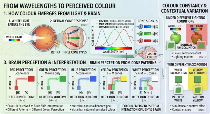
Part 1: How Colour Emerges From Light & Brain
The left side of the infographic outlines the physiological and neural process of colour vision:- White Light Input: The sequence begins at “1. WHITE LIGHT ENTERS THE EYE”, showing a beam of ‘WHITE LIGHT’ with a color spectrum icon passing through a simplified eye to reach the labeled ‘RETINA’.
- Retinal Cone Response: A zoom callout labeled “2. RETINAL CONE RESPONSE” provides a detailed view of the ‘THREE CONE TYPES’ (Red, Green, Blue). A key plot displays overlapping ‘CONE SENSITIVITY’ curves for Short (S) (Blue-Sensitive Cone), Medium (M) (Green-Sensitive Cone), and Long (L) (Red-Sensitive Cone), charting ‘CONE SENSITIVITY’ against ‘WAVELENGTH (nm)’. Neural ‘CONE SIGNALS’ (labeled S, M, L) link these response patterns to color bars and ket symbols.
- Brain Perception and Interpretation: Neural paths, indicated by colored traces, lead into a brain diagram with a labeled ‘VISUAL CORTEX’ for “3. BRAIN PERCEPTION & INTERPRETATION”. This section provides five specific examples showing perceived colour arising from different cone-response combinations:
- RED PERCEPTION: Long (L) cone only (Red signal arrow).
- GREEN PERCEPTION: Medium (M) cone only (Green signal arrow).
- BLUE PERCEPTION: Short (S) cone only (Blue signal arrow).
- YELLOW PERCEPTION: Medium (M) and Long (L) cones combined (Green and Red arrows merging).
- WHITE PERCEPTION: Short (S), Medium (M), and Long (L) cones combined (All three arrows merging).
Part 2: Colour Constancy & Contextual Variation
The right side of the infographic illustrates dynamic variation in perceived colour using two sub-sections, each against a distinct background pattern:- Under Different Lighting Conditions: A green apple is shown under ‘WHITE LIGHT’ (with spectrum icon) and ‘RED LIGHT’ (with spectrum icon). Zoom callouts show the identical physical patch of the apple. It appears green under white light and differently colored under red light, with bullet points noting ‘Colour constancy effect’ and ‘Lighting matters’.
- With Different Backgrounds: Two identical green patches are shown on a ‘WHITE BACKGROUND’ and a ‘YELLOW BACKGROUND’. Callout magnifications of ‘PATCH ON WHITE’ and ‘PATCH ON YELLOW’ show how context changes perception, with bullet points for ‘Simultaneous contrast effect’ and ‘Context matters’.
The Evolutionary Path: History, System Barriers, and Foundry Paradigms
The Historical Journey
Contemporary Technical Hurdles
Future Paradigms: Quantum-Dot Gamuts and Context-Aware Rendering
- Narrow-Emission Quantum-Dot Displays: To prevent overlapping cone stimulation errors, fabrication foundries are deploying specialized cadmium-free quantum dots inside display Backlight units. These nano-crystals generate highly pure, narrow-spectrum light spikes that align with L, M, and S cone absorption profiles, expanding color volume boundaries close to full human perceptual limits.
- Perceptual Context-Aware AR Engine Matrices: To sustain consistent rendering across dynamic environments, wearable augmented reality optics are deploying real-time ambient spectroradiometers. These sensors analyze ambient light changes and background properties, triggering real-time chromatic shifts within the rendering engine to preserve structural readability under intense glare or changing environmental scatter lines.
The Visible Spectrum
| Approximate Region | Typical Colour Experience | Important Note |
|---|---|---|
| Shorter visible wavelengths | Violet and blue | Often scatter strongly and are detected mainly through short-wavelength cone responses |
| Middle visible wavelengths | Green and yellow-green | Human daylight vision is highly sensitive in this region |
| Longer visible wavelengths | Orange and red | Important in warmth, warning signals, displays, and many natural colour cues |
| Mixed wavelengths | White, pink, brown, purple, and many surface colours | Many perceived colours do not correspond to a single pure wavelength |
Rods and Cones
| Photoreceptor | Main Role | Student-Friendly Meaning |
|---|---|---|
| Rods | High sensitivity in low light | Useful for night vision, but not for detailed colour discrimination |
| Cones | Colour and fine detail in brighter light | Useful for daylight colour vision, reading, and detailed central vision |
The Three Cone Types
| Cone Type | Most Sensitive To | Common Simplified Association | Important Caution |
|---|---|---|---|
| S cones | Shorter wavelengths | Blue-violet region | They respond across a range, not to only one colour |
| M cones | Medium wavelengths | Green region | Their sensitivity overlaps strongly with other cone types |
| L cones | Longer wavelengths | Yellow-red region | They do not simply detect “red” alone |
Trichromatic Colour Vision
Opponent Processing
| Opponent Channel | Simple Description | Why It Matters |
|---|---|---|
| Red-green comparison | Compares long- and medium-wavelength cone signals | Important for many colour distinctions and common colour vision deficiencies |
| Blue-yellow comparison | Compares short-wavelength cone input with combined longer-wavelength input | Helps explain blue-yellow contrasts and afterimages |
| Light-dark comparison | Compares brightness information | Important for contrast, edges, and form perception |
Colour Is Not Only Wavelength
Colour Constancy
Colour Adaptation
Contrast and Context
| Context Effect | What Happens | Example |
|---|---|---|
| Simultaneous contrast | Background changes perceived colour or brightness | Grey looks lighter on black than on white |
| Colour contrast | Surrounding hue shifts perceived hue | A colour may look more bluish beside orange |
| Shadow interpretation | Brain compensates for assumed lighting | A shaded surface may be perceived as lighter than its raw brightness suggests |
| Display contrast | Screen background changes readability | Low-contrast text becomes harder to read |
Brightness, Lightness, and Colourfulness
| Perceptual Idea | Simple Meaning | Example |
|---|---|---|
| Brightness | How intense light appears | A phone screen looks brighter at high setting |
| Lightness | How light or dark a surface appears | A white wall looks light even in moderate shade |
| Hue | The colour family | Red, green, blue, yellow |
| Saturation | How pure or intense a colour appears | Deep red versus pale pink |
| Colourfulness | How vivid the colour experience is | A neon sign appears highly colourful |
Additive Colour Mixing
| Light Mixture | Typical Perceived Result |
|---|---|
| Red + green | Yellow |
| Green + blue | Cyan |
| Blue + red | Magenta |
| Red + green + blue | White or near-white, depending on balance |
Subtractive Colour Mixing
| Material Process | Simple Meaning | Common Context |
|---|---|---|
| Absorption | Some wavelengths are removed | Paints, inks, dyes, filters |
| Reflection | Some wavelengths return to the eye | Coloured objects |
| Transmission | Some wavelengths pass through | Coloured glass or filters |
Metamers: Different Spectra, Same Colour Appearance
Colour Vision Deficiency
| General Type | Simple Description | Common Practical Issue |
|---|---|---|
| Red-green deficiency | Reduced ability to distinguish some reds, greens, browns, or oranges | Traffic lights, maps, charts, warning colours, wiring, educational diagrams |
| Blue-yellow deficiency | Reduced ability to distinguish some blue-yellow differences | Less common but can affect colour sorting and visual design |
| Monochromatic or very limited colour vision | Greatly reduced or absent colour discrimination | Rare and often associated with other visual challenges |
Colour Accessibility in Design
| Design Practice | Why It Helps |
|---|---|
| Use labels as well as colour | Information remains clear even if colours are hard to distinguish |
| Use patterns or symbols | Supports interpretation without colour dependence |
| Ensure strong contrast | Improves readability for many users |
| Avoid red-green-only coding | Reduces barriers for common colour vision deficiencies |
| Test charts in greyscale | Checks whether meaning survives without hue |
Visual Perception Beyond Colour
Depth, Motion, and Attention
Colour in Displays
Colour in Data Visualisation
| Visualisation Choice | Better Practice |
|---|---|
| Two categories | Use distinct colours plus labels or symbols |
| Ordered values | Use a gradual lightness scale as well as hue |
| Critical warning | Use colour plus text, icon, position, or shape |
| Scientific heat map | Choose colour maps that preserve visible differences and avoid false boundaries |
| Educational diagram | Make the meaning clear even if printed in greyscale |
Applications of Colour Vision and Perception
Education and Diagrams
Colour can help students distinguish structures, forces, pathways, categories, and relationships, but labels and contrast remain essential.
Display Design
Screens depend on RGB colour mixing, brightness control, contrast, viewing distance, and human visual limits.
Data Visualisation
Graphs, maps, and dashboards use colour to show patterns, categories, intensity, risk, or change.
Medical and Scientific Imaging
False colour, fluorescence, staining, and contrast enhancement help reveal structures that are not naturally visible.
Accessibility
Colour-aware design helps users with different visual abilities understand information more reliably.
Art and Design
Artists and designers use hue, saturation, contrast, harmony, and perception to guide attention and emotion.
Safety and Signalling
Traffic lights, warning signs, instrument panels, and alerts use colour, but should also use position, shape, or labels.
Human-Computer Interaction
Interfaces use colour to guide users, show states, indicate errors, create hierarchy, and support readability.
Connections with Wider Physics and Technology
Light and Optics
Colour begins with light, wavelength, reflection, transmission, absorption, and the formation of images by optical systems.
Electromagnetic Waves
Visible light is part of the electromagnetic spectrum, and its wavelength and energy influence how it interacts with the eye.
Wave Optics
Diffraction, interference, spectral composition, and wavelength all influence colour-related optical phenomena.
The Eye as an Optical System
The eye focuses light onto the retina, where rods and cones begin the process of visual perception.
Bio-Optics
Colour vision is a biological optical process, connecting photoreceptors, light interaction, imaging, and neural interpretation.
Atmospheric and Environmental Optics
Haze, glare, scattering, and lighting conditions modify raw spectra before light arrays reach human photoreceptors.
Data Science and Analytics
Statistical image analytics parse color volumes and coordinate histograms to optimize image recognition arrays.
Human-Computer Interaction and UX
Readable, accessible, and comfortable interfaces depend on colour contrast, visual hierarchy, and human perception profiles.
Graphic Design
Graphic design uses colour, contrast, visual balance, and perception to communicate meaning effectively.
Artificial Intelligence
Computer vision systems process colour differently from humans, creating important questions in image recognition, safety, and design.
Learning Pathway Within Visual Optics
The Eye as an Optical System
Learn how the cornea, pupil, lens, retina, and optic nerve work together to form images and begin visual perception.
Vision Correction with Lenses
Understand how glasses, contact lenses, and lens power correct myopia, hyperopia, astigmatism, and presbyopia.
Colour Vision and Visual Perception
Current page. Explore how cones, wavelengths, colour mixing, contrast, adaptation, context, and the brain shape colour experience.
Displays, AR, and Human Vision
Discover how screens, pixels, refresh rates, contrast, AR optics, eye comfort, and human vision shape modern display design.
Quick Check: Colour Vision and Visual Perception
Quick Check: Seeing Colour
Common Misunderstandings About Colour Vision
Misunderstanding 1: Colour Exists Only in Objects
Misunderstanding 2: Each Cone Detects Only One Colour
Misunderstanding 3: Wavelength Alone Always Determines Colour
Misunderstanding 4: Colour Blindness Means Seeing Only Black and White
Misunderstanding 5: Screen Colours Are the Same as Real Object Colours
Key Terms
- Brightness
- The perceived intensity of light.
- Colour adaptation
- A temporary change in visual sensitivity after exposure to a particular colour or lighting condition.
- Colour constancy
- The tendency to perceive object colours as relatively stable under changing illumination.
- Colour vision
- The ability to distinguish visual experiences based on wavelength composition and cone-response patterns.
- Colour vision deficiency
- A condition in which colour discrimination differs from typical trichromatic vision.
- Cone cells
- Photoreceptors that support colour discrimination and fine detail in brighter light.
- Gamut
- The complete subset of colors that a specific display hardware or optical emitter can physically reproduce.
- Hue
- The colour family of a perception, such as red, green, blue, or yellow.
- Metamer
- A pair of different light spectra that appear to have the same colour under certain viewing conditions.
- Opponent processing
- Neural comparison of colour signals in opposing channels such as red-green and blue-yellow.
- Rod cells
- Photoreceptors that are highly sensitive in dim light but do not support detailed colour vision.
- S, M, and L cones
- Short-, medium-, and long-wavelength cone types that provide the basis for typical human trichromatic colour vision.
- Saturation
- The strength, purity, or vividness of a colour experience.
- Trichromacy
- Colour vision based on comparing signals from three cone types.
- Visual perception
- The process by which the retina and brain interpret visual signals as meaningful objects, colours, shapes, motion, and scenes.
Review Questions
- What is colour vision?Answer: Colour vision is the ability to distinguish visual experiences based on wavelength composition and the relative responses of cone photoreceptors.
- Why are cones important for colour vision?Answer: Cones provide the main basis for colour discrimination in brighter light. Typical human vision uses three cone types with different wavelength sensitivities.
- What are S, M, and L cones?Answer: They are cone types most sensitive to short, medium, and long wavelength regions. Their combined responses support typical human colour vision.
- What does trichromatic colour vision mean?Answer: It means colour perception is based partly on comparing signals from three cone types.
- What is opponent processing?Answer: Opponent processing compares visual signals in opposing channels such as red-green, blue-yellow, and light-dark.
- What is colour constancy?Answer: Colour constancy is the ability to perceive object colour as relatively stable even when illumination changes.
- Why do screens use red, green, and blue light?Answer: Screens use red, green, and blue subpixels because combinations of these lights can stimulate the three cone systems in ways that produce many perceived colours.
- Why should visual designs not rely on colour alone?Answer: People differ in colour perception, and some have colour vision deficiency. Good design uses labels, contrast, shape, symbols, and layout as well as colour.
Thought-Provoking Questions
- Why is colour not simply a property of light alone?Answer: Light provides the physical stimulus, but colour experience depends on cone responses, neural comparison, adaptation, context, and brain interpretation.
- How does colour constancy help us live in a changing visual world?Answer: It helps us recognise objects despite changes in lighting, so a familiar object does not seem to become completely different every time the illumination changes.
- Why can colour illusions teach us about the visual system?Answer: Illusions reveal that perception is constructed by the brain using assumptions about light, shadow, contrast, and context.
- Why is colour accessibility important in education?Answer: Students may perceive colours differently. Accessible diagrams help more learners understand the content without depending only on hue.
- How does display technology depend on human colour vision?Answer: Displays use RGB light mixing because the human visual system can interpret many combinations of red, green, and blue stimulation as different colours.
Comprehensive Numerical Problems with Solutions
- Calculate the frequency of light with a wavelength parameter value of 600 nm.Solution:Apply the wave velocity expression:$$f = \frac{c}{\lambda}$$Convert the wavelength dimension parameters to meters ($600\text{ nm} = 600 \times 10^{-9}\text{ m}$):$$f = \frac{3.00 \times 10^8\text{ m/s}}{600 \times 10^{-9}\text{ m}} = 5.00 \times 10^{14}\text{ Hz}$$Answer: The wave frequency value measures exactly 5.00 × 10¹⁴ Hz.
- Calculate the single photon energy parameter for a green light wave oscillating at wavelength 550 nm.Solution:Use the standard inverse wavelength energy function:$$E = \frac{hc}{\lambda}$$Substitute values ($h = 6.626 \times 10^{-34}\text{ J}\cdot\text{s}$, $c = 3.00 \times 10^8\text{ m/s}$, $\lambda = 550 \times 10^{-9}\text{ m}$):$$E = \frac{(6.626 \times 10^{-34}\text{ J}\cdot\text{s}) \times (3.00 \times 10^8\text{ m/s})}{550 \times 10^{-9}\text{ m}} \approx 3.6141 \times 10^{-19}\text{ J}$$Answer: The green photon packet holds an energy of approximately 3.61 × 10⁻¹⁹ J.
- A localized display pixel registers emission intensities of 80 units for Red, 160 units for Green, and 80 units for Blue. Identify which sub-pixel channel runs strongest.Solution:Directly compare the numerical values: Red = 80, Green = 160, Blue = 80. The value for the green channel is the highest within the active coordinates set.Answer: The green emitter sub-pixel channel is mathematically the strongest.
- A display screen panel processes standard 8-bit tracking channels scaled from 0 to 255 units. If an active color point presents an RGB vector value of (255, 255, 0), evaluate which channels are fully turned on.Solution:Analyze the separate array entries: the Red parameter equals 255 (maximum amplitude value), the Green parameter equals 255 (maximum amplitude value), and the Blue parameter measures 0 (minimum baseline value).Answer: The Red and Green sub-pixel channels are fully active, generating a perceived yellow hue.
- A blue light packet displays a wavelength coordinate of 450 nm, while a red light packet tracks at a wavelength of 650 nm. Determine which single photon holds a higher energy value.Solution:Photon energy scales inversely relative to wavelength footprint limits ($E = \frac{hc}{\lambda}$). Shorter wavelengths correspond to higher single-quantum energy parameters. Because 450 nm is a shorter wavelength than 650 nm, the blue light photon holds more energy.Answer: The 450 nm blue light photon holds higher individual energy.
- A static information chart utilizes only red and green shifts to categorize items. If exactly 8% of a target student population exhibits red-green color vision deficiency, calculate how many learners in a lecture hall containing 50 individuals might encounter reading barriers.Solution:Multiply the percentage metric fraction by the absolute sample count baseline:$$\text{Affected Students} = 0.08 \times 50 = 4$$Answer: Exactly 4 students are expected to struggle with the chart interpretation.
- A focal display test patch measures a local luminance brightness of 200 units against a background field reading 50 units. Evaluate the net absolute brightness contrast step difference.Solution:Subtract the background noise parameter from the dominant patch amplitude value:$$\text{Brightness Difference} = 200 – 50 = 150\text{ units}$$Answer: The absolute contrast step difference measures exactly 150 units.
- A chart uses 5 distinct color bands to indicate separate tracking categories. When printed down onto a monochrome grayscale page, only 2 bands remain uniquely readable. How many categories lose their clear visual distinction?Solution:Subtract the remaining clear channels from the initial color selection matrix:$$\text{Obscured Categories} = 5 – 2 = 3$$Answer: Exactly 3 category bands lose their clear visual distinction.
External References for Further Reading
- National Eye Institute: How the Eyes Work — A clear overview of the cornea, pupil, lens, retina, and optic nerve.
- OpenStax College Physics: Color and Color Vision — A physics-based explanation of colour, wavelength, and colour perception.
- OpenStax Psychology: Vision — A useful introduction to rods, cones, trichromatic theory, opponent-process theory, and perception.
- NCBI Bookshelf: Cones and Color Vision — A detailed neuroscience reference on cone responses and colour vision.
- American Academy of Ophthalmology: How Humans See in Color — A public-facing explanation of cone cells and colour perception.
- American Academy of Ophthalmology: What Is Color Blindness? — A helpful guide to colour vision deficiency and its practical effects.